This house was a proud builder’s showcase home when it was built in the late 1990’s. Bless their builder’s hearts, they tried to shove every bell and whistle possible into the design. The owners then tried to remodel it themselves to bring harmony to the house. And then, they had a massive water leak destroying many of the cabinets and floors. But it is not over; that builder they hired to do the remodel…he was cutting corners and they had to let him go. By the time this couple found me, they were overwhelmed with the clutter, the disfunction and the decision: should we stay or should we go?? Together we investigated all of the options. While they found a beautiful new house, they needed to remodel this one in order to maximize its resale value. Our goal was to rebuild and refashion the kitchen, modernize the bathrooms and unify the style of the house (with all of those crazy builder “updates”) and keep costs down as much as possible. It was a tall order but all’s well that ends well; the house sold within days of going on the market and above the asking price!
Century Oaks Flip
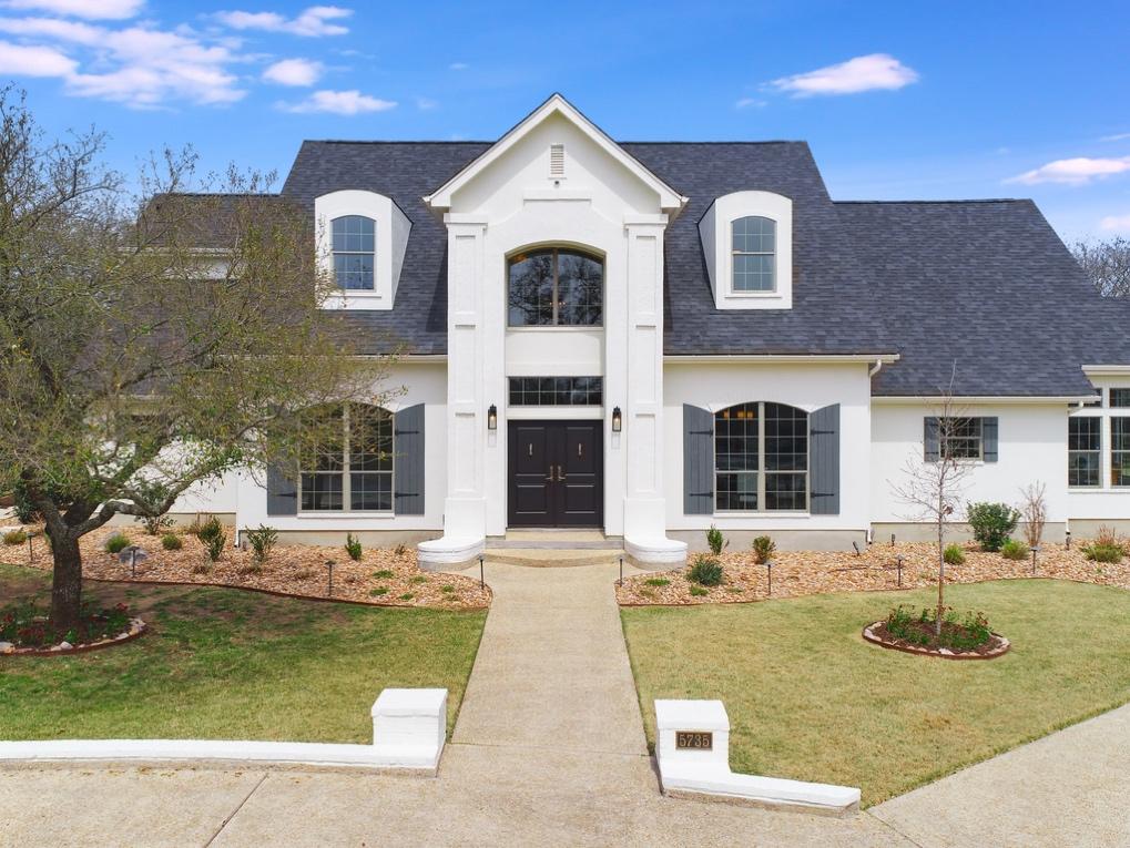
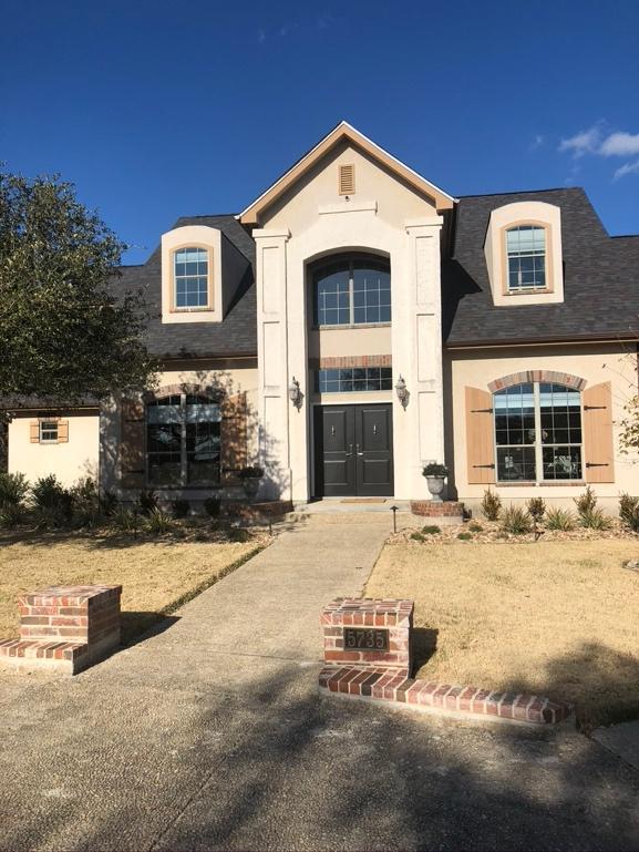
This house had no discernible style. Was it French? Traditional? The color was beige, bordering on orange, with an unidentifiable contrasting trim color. It was stucco except for the brick lintels above the arched windows. The naked dormer windows were arched as well but right next to the gabled two story entry. And the front lights were just plain cheap looking. Ugh. Without a major renovation, we were stuck with the architectural details. But I was able to minimize them with paint. The brick and the stucco became one color. The front doors were relatively new. I kept them but painted the shutters in a complementary color as not to pull your eye in too many directions. The new front light fixtures help unify the scheme without breaking the bank. In a nutshell, paint is your friend to hide unfortunate architecture!!
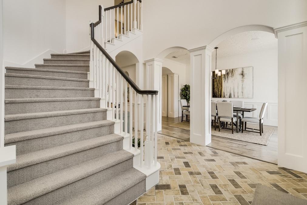
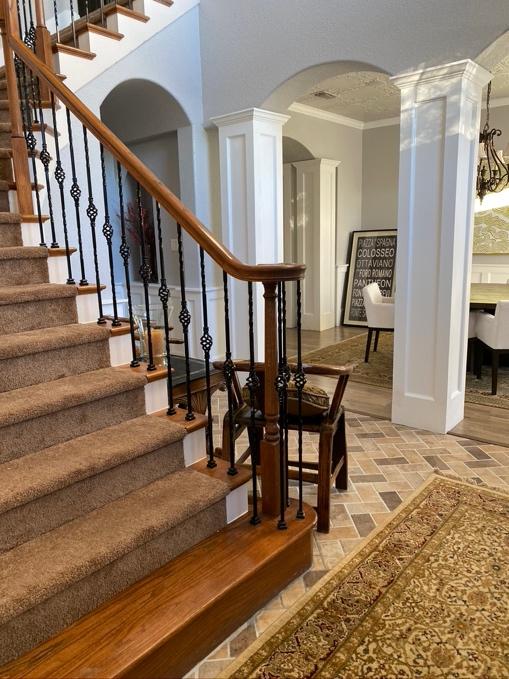
Do you know why the before picture makes no sense? You have two entirely different woods on the stairs and in the dining room. Single basket iron balusters conflict with the thick white column panels. Light gray walls do not relate at all to the beige/brown herringbone floor. The answer is to harmonize as much as possible. Once again, white paint is my knight in shining armor, allowing me to minimize the oversized columns. The stair carpet is that perfect hue between grey and beige, unifying the brick and the dining floors. The balusters become plain white spindles in deference to the columns and the painted black stair rail provides just the right amount of contrast.
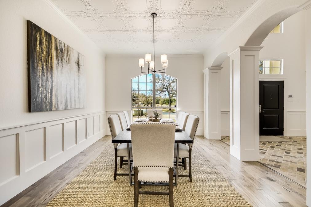
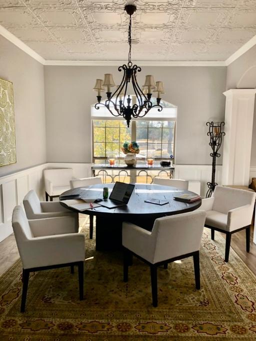
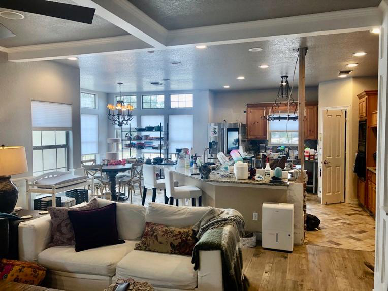
The ornamental tin ceiling tiles were a true “REALLY!?” moment for me. What part of this house nods to a Victorian vernacular? And paired with the rustic Texas ornamental light fixture?? I am speechless. Remember that budget was the name of the game with this renovation and removing the ceiling tile was too costly. I tried to hide it by painting the trim, walls and ceiling the same color and adding a minimal light fixture so that no single feature jumps out at you.
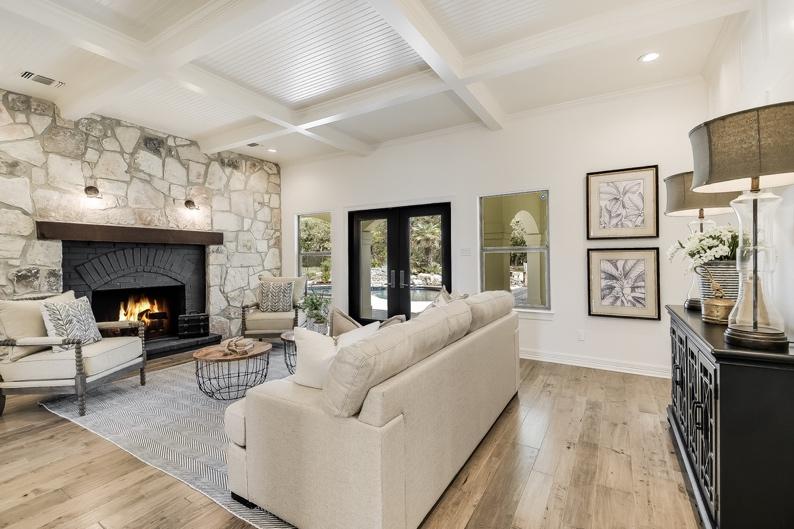
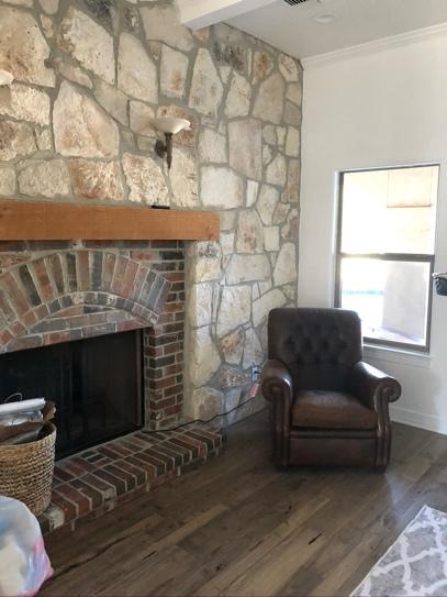
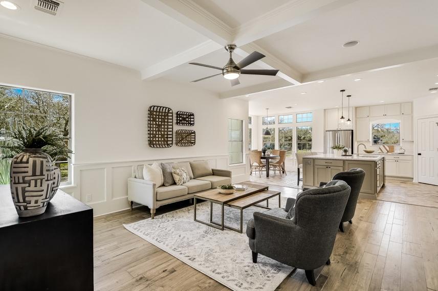
Remember builder bells and whistles?? This living room is right next to the Victorian tin ceiling in the dining room. Of course, they decided to add a stone wall, which is not reflected in any other part of this house?! I painted the fireplace grey – the same grey as the exterior shutters – and I whitewashed the stone wall. New modern light fixtures helped. Not perfect, but a whole lot better.
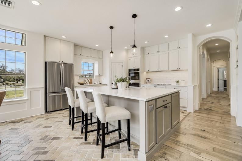
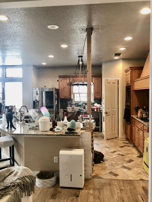
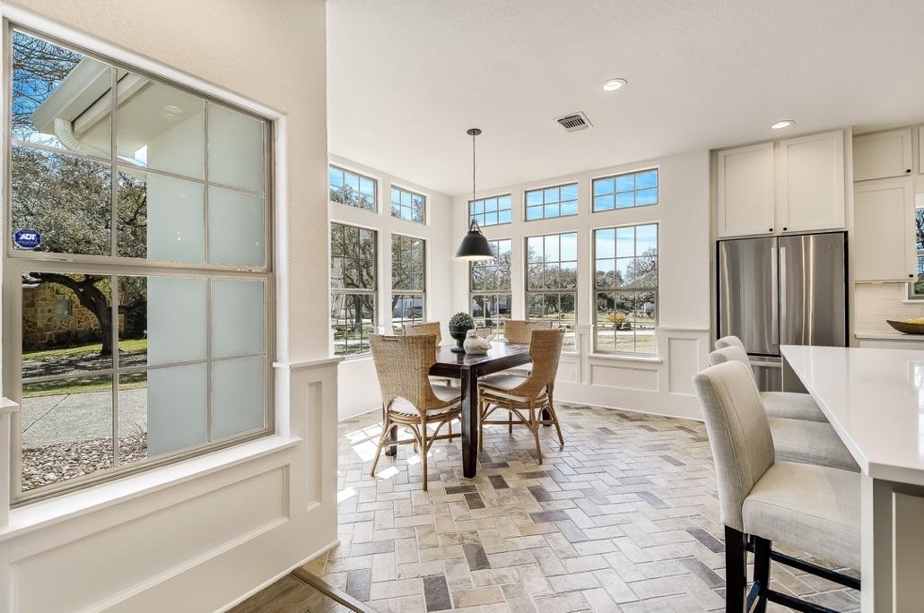
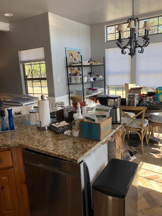
Water damage destroyed this kitchen before I ever got involved with the project. New cabinets were not optional and white was an easy choice. Notice the vertical beam at the end of the island that had previously been a column. It was awkwardly placed and I assumed it was load bearing – I mean, why would you keep it otherwise?? You can image my surprise when the engineer declared it ornamental only. That pole disappeared in a hot second and it is a much cleaner look. Engineers are your friends.
The island was irregularly shaped in the original kitchen layout. It was an inefficient footing that encroached on the flow of traffic around the kitchen and the breakfast table. Also, this entire area was rectangular with the odd shape of the island dropped into it. The new rectangular island has a more practical surface area – with the added benefit of giving space to the breakfast room and remaining consistent with the proportions of the new kitchen.
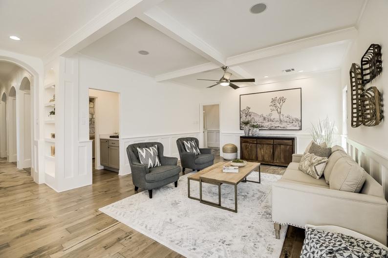
The house was staged before it went on the market and I worked closely with the staging company to get the feel just right – mostly neutrals complemented by texture. We had enough going on with this house and I did not want to the furniture to add another competing component. The staging company did a GREAT job!
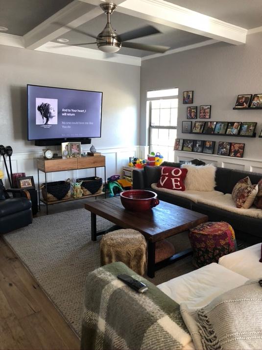
Yes, the house is staged, meaning that it is exaggerated, and people do not normally live without some stuff. But the concept is still valid. Clutter can be anxiety producing. Also, the “after” picture was taken from the vantage point of the door that you would enter coming from the garage, meaning that this is the first view you would have walking into your house. My point: Sight lines and visual calm are important elements to consider when creating a cohesive design plan.
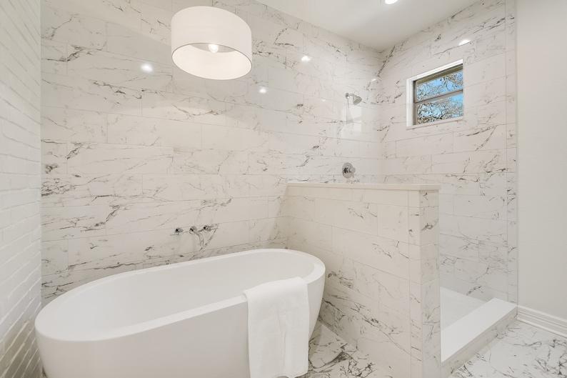
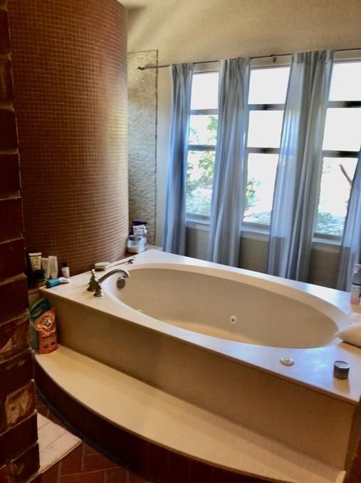
The original builder thought it was a fabulous idea to include an open-air circular shower in the master bath with a free floating tub in the middle. (Again – WHY?!) My clients were never going to live in this house again but they were insistent that the circular shower had to go! I was happy to oblige, not only because it was an eyesore but also because it took up a lot of valuable real estate. I cut the room in half and created this beautiful marbled wall bathing room (okay – porcelain tile but pretty darn good looking!). Note that the shower eventually got a beautiful seamless glass shower wall and door but they sold the house so fast that I did not get a photo! The other half of the space became a new closet because more storage space beats an open orange tiled circular shower any day!!
There are two competing theories: “More is more” and “Less is more”. The original builder sided heavily with the “More is more” approach. If you have actually been reading any of my commentary, you have probably guessed that I veer in the opposite direction. I do like the textural aspect of the brick in this bath when it is painted the color of the walls. But it is enough. The simple dark grey cabinets with the white bordered mirror and chrome fixtures create a soothing environment – no bells or whistles needed.
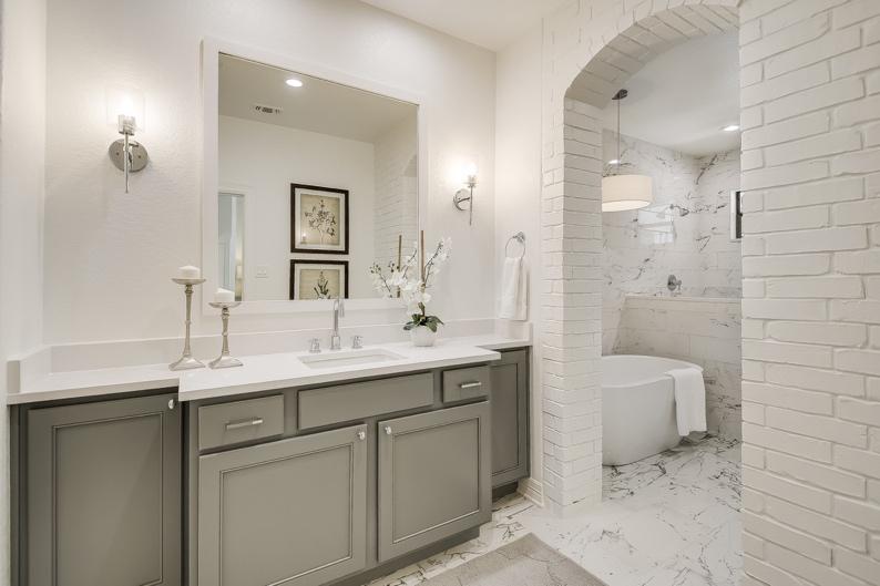
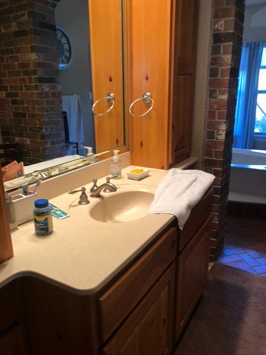
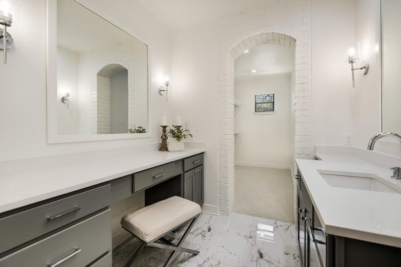
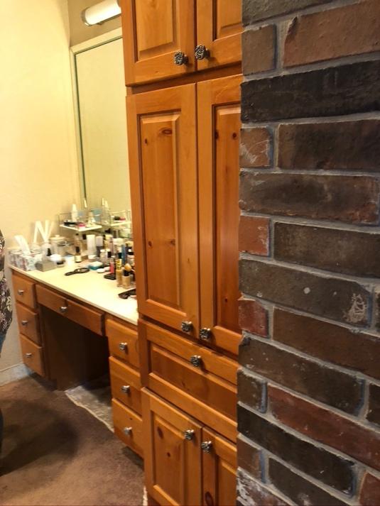
The layout of the original master bath sinks was clever – kudos to the builder, for once!! The two sinks are back to back, giving each person his and her own spaces but they still remain connected – and I kept that configuration. My original design had suspended mirrors, further linking the spaces. Alas, the budget did not allow it but the areas still work nicely. You can see the new closet (that replaced the old circular shower) in the back of the photo.
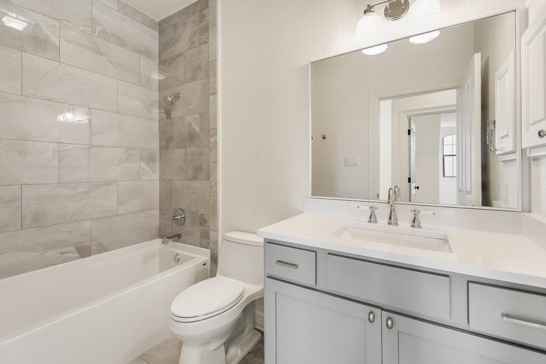
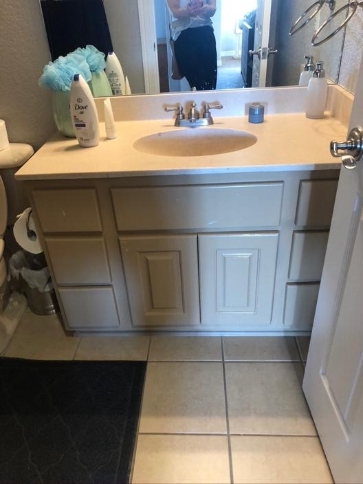
A secondary bathroom comes back to life with very affordable tile and fixtures. Some features that make this bathroom shine are the framed mirror (not glued to the wall), simple shaker partial overlay cabinetry, taking the tile surround to the ceiling, and the 3 CM quartz countertop. It does not have to be expensive to be good looking! I was really tempted to do a 24 x36 mirror and eye-catching sconces on each side to give the bathroom a little more pizzaz, but that would require patching and additional electrical work. In a flip house, save where you can – little cuts here and there add up to keep the budget in check.
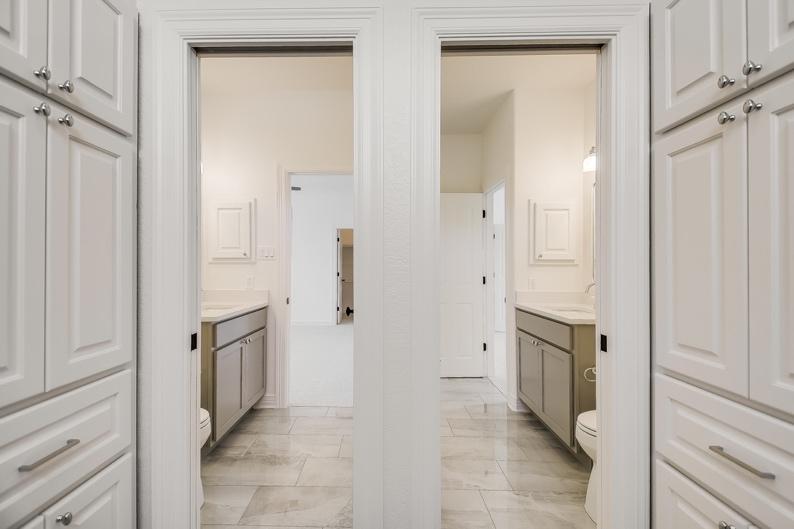
I took the same approach in this Jack and Jill bath as in the secondary bath. I changed up the plumbing and lighting fixtures but used the same tile to save on overages. Also, notice the softer grey and white tile in this bath. In my attempt to give this house some stylistic consistency, I stayed true to the color theme but varied it with a softer grey paint on the secondary bath cabinets and gave the master bath tile with bolder veining. The differences are subtle but meaningful as you walk from room to room.
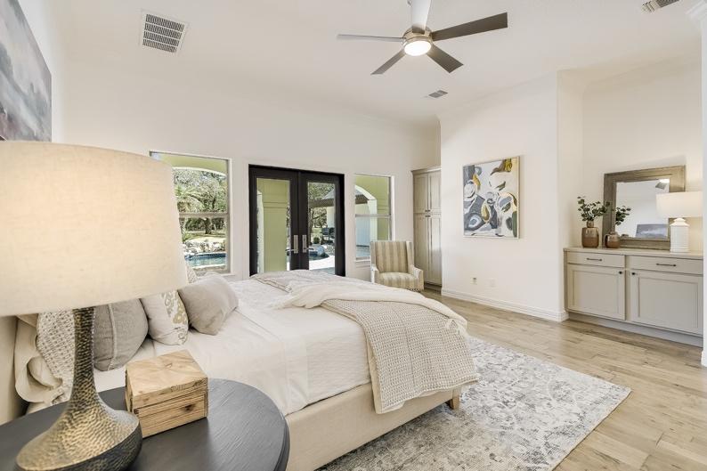
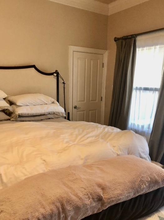
Bedrooms are for beds. As this sounds obvious, it means that bedrooms can be rather plain without the furniture. In this respect, the stagers did a wonderful job of giving the room presence. Two things to note. First, you see that door in the “before” picture, we got rid of it. It was an odd second entrance to the bathroom and it took up valuable wall space on both sides. It was not possible to add even a slim nightstand on the right side of the bed without blocking that door?? Also, those cabinets are new. The nooks practically screamed to be filled, which provided the perfect opportunity to add storage for extra blankets, sheets, pillows and luggage. And who doesn’t want more storage?!?