This house sits in a beautiful neighborhood with stunning and stately homes. But the owners knew that their home was looking tired and that it needed a refresh – a BIG refresh. Overwhelmed with where to start, they called a reputable local architect who worked with them for two years developing a plan to add 2000 square feet to their already large home. With their children grown and gone, a 7000 square foot house seemed costly and just…. wrong. Soon after, a mutual friend recommended that they call me. Together, we overhauled every part of this house to create functional, distinctive and beautiful spaces.
Colonial Revival
Photo Gallery
How did we tackle this renovation? Read on…
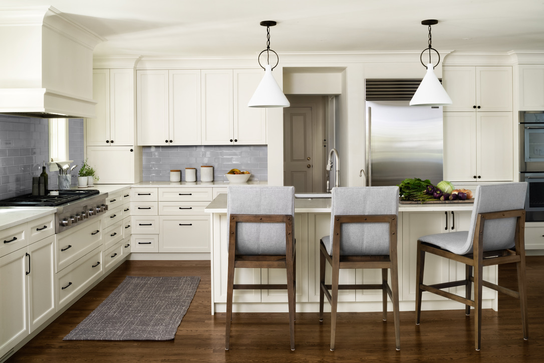
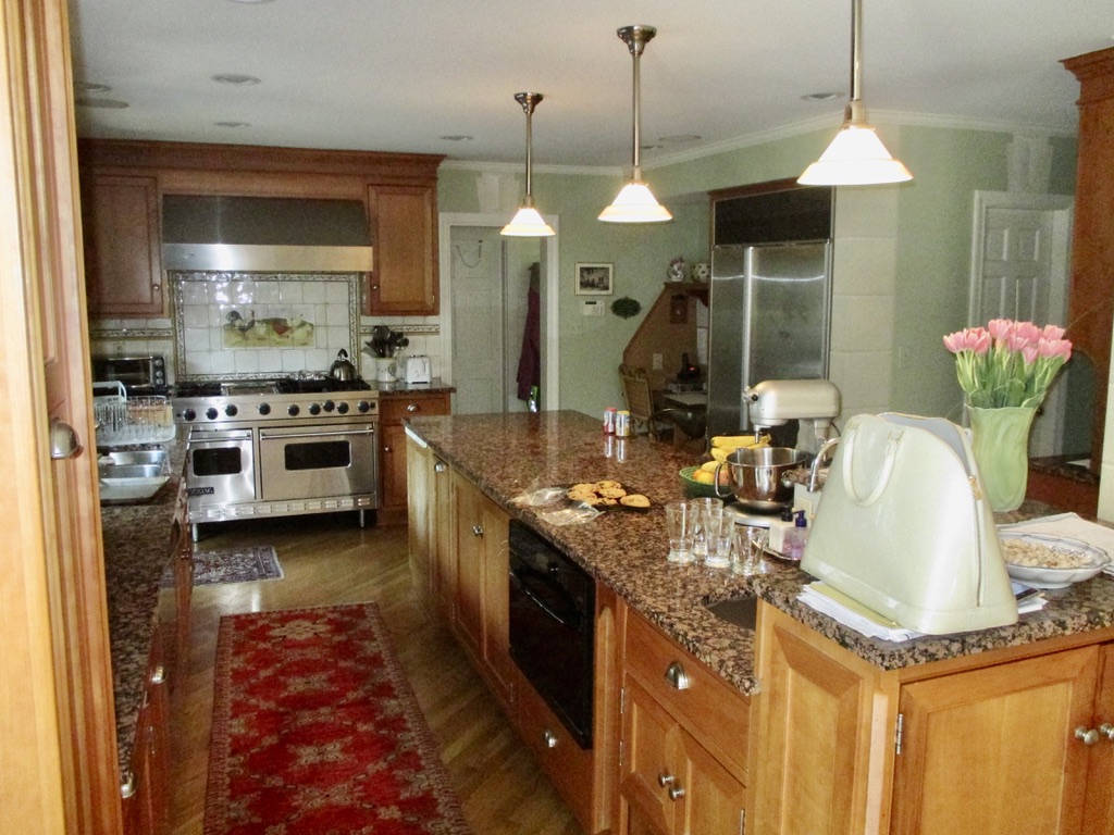
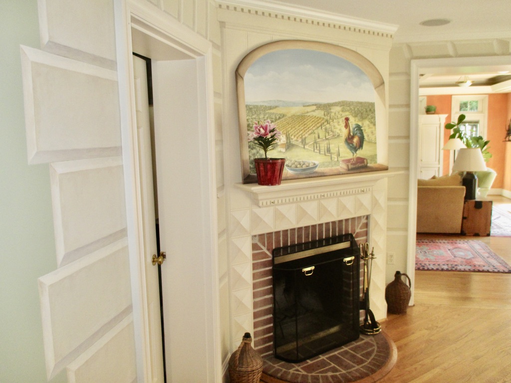
The Tuscan villa décor might have worked in the early 90’s but the granite countertops and bright colors now felt outdated and dark. A big priority was to modernize, simplify and lighten the interiors. That was the easy part. Classic white cabinets, grey subway tile, Carrera quartz countertops, antique bronze cabinet hardware, modern pendants and a darker wood stain on the floors did the trick. And the kitchen looks and lives completely different.
The not so easy part was opening up the space. We avoided a costly addition by relocating the powder room and eliminating a cramped hallway. The clients wanted space for more casual entertaining, which we achieved. And then we went one step further…
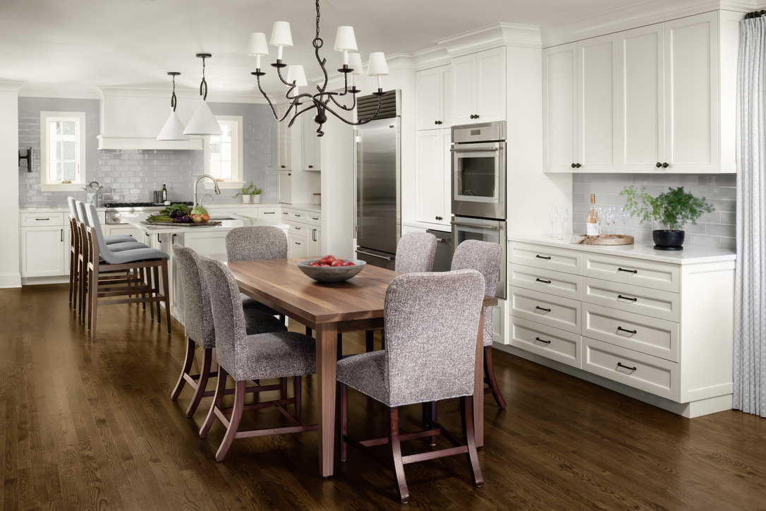
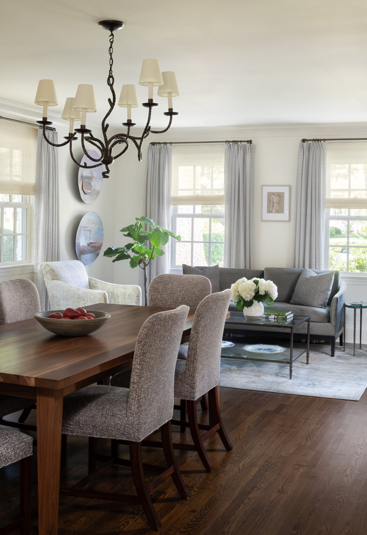
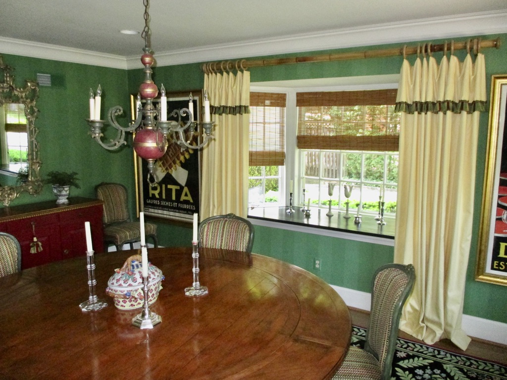
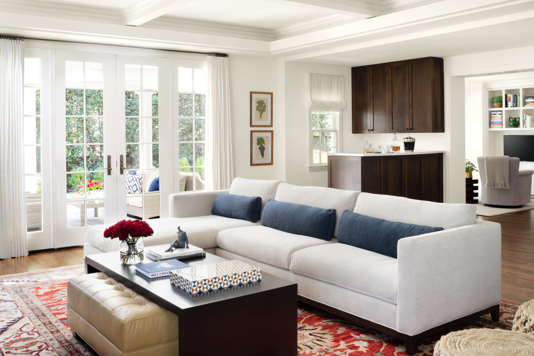
The old dining room was prime real estate in this house, but rarely used and cut off from everything else. By removing the walls and opening up this room to the kitchen, we had room for another a sitting area. Which means that the entire length of the house – front to back – becomes multifunctional and usable space. Chat while you are cooking or chat while you are lounging and cooking; everyone is included. It might just look like tables, sofas and chairs but done right, they create the feeling of togetherness, which is really what we are aiming for, right?!? If that is not what you are looking for, well, that is an entirely different conversation!
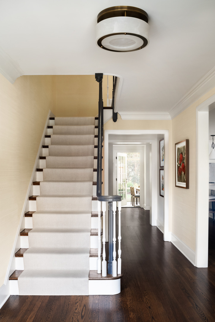
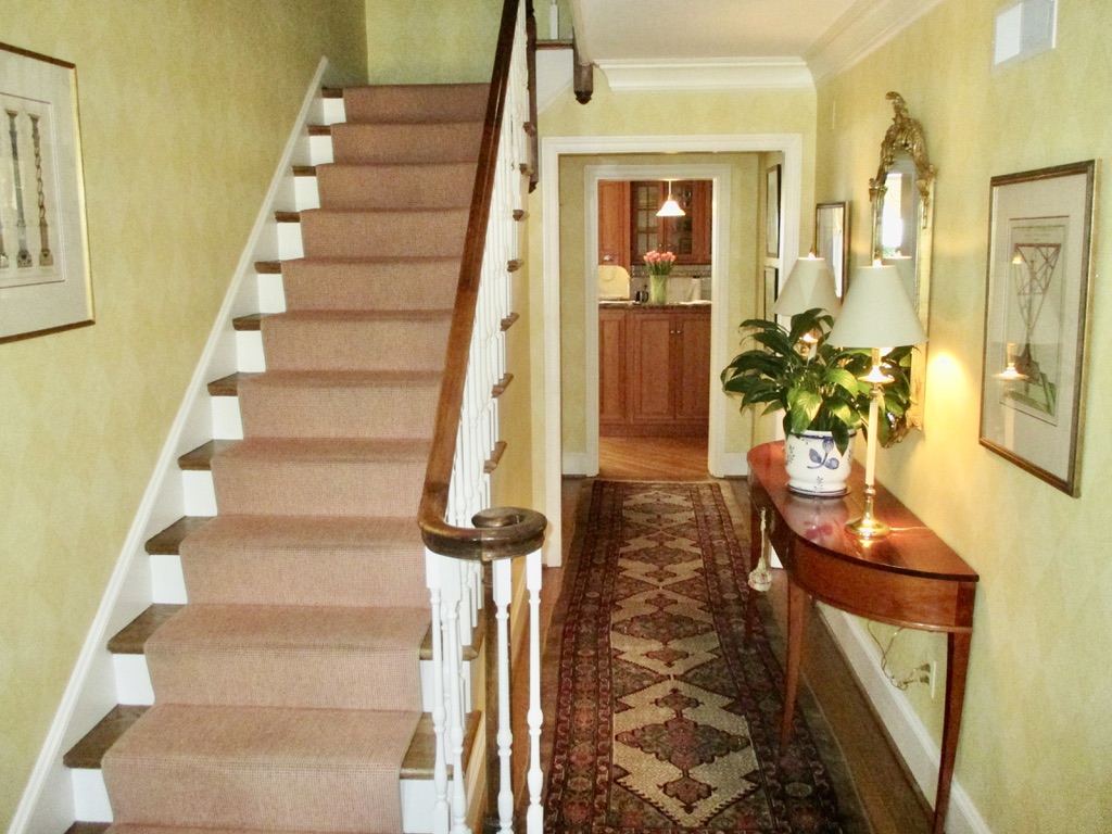
This is the entranceway. It looks a lot different because it is not yellow and orange and it does not have an oversized tasseled console in the middle. Two other things are significant here. First, we shortened that wall to new kitchen/dining/sitting area, which both minimizes the claustrophobic hallway and creates a natural and inviting opening to the main gathering space. Second, the door to the backyard was previously in the middle of the main workspace in the kitchen. Instead of shimmying around each other in a busy kitchen to get outside, we put the door in a natural walkway. The additional natural light and the lovely outdoor view are bonuses.
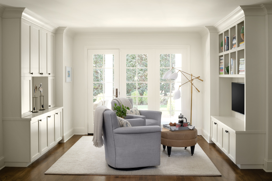

Remember, this couple lives by themselves. They also requested a fireplace in their TV sitting room. Instead of figuring out how to install another fireplace, I moved their sitting room to an area with an existing fireplace. They now have a cozy sunlit area for just the two of them, and we avoided the time and expense of building another fireplace.
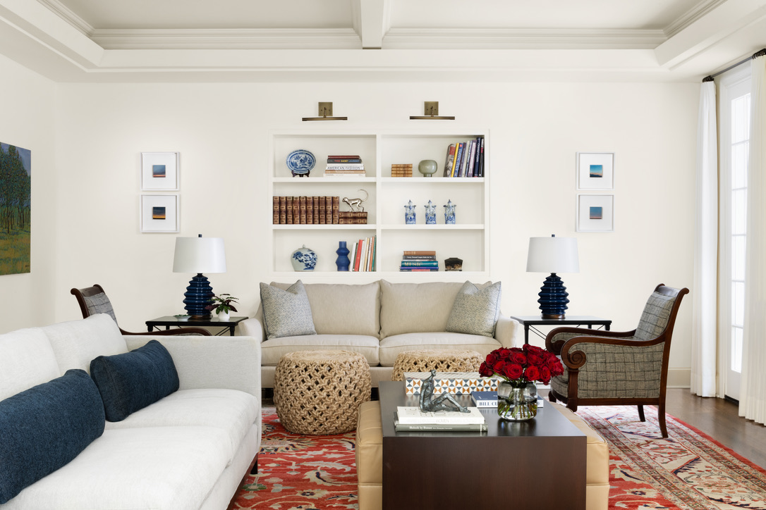
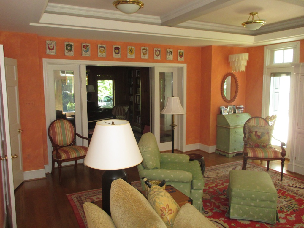
I understand why this couple dove headfirst into the Tuscan theme when they first renovated this home; they like color. I like color too! But in small doses. You don’t need a fully painted wall of the Italian countryside and faux quoins to dominate every nook and cranny. Well placed colorful artwork and two blue velvet stools add liveliness but preserve the tranquility of the space.
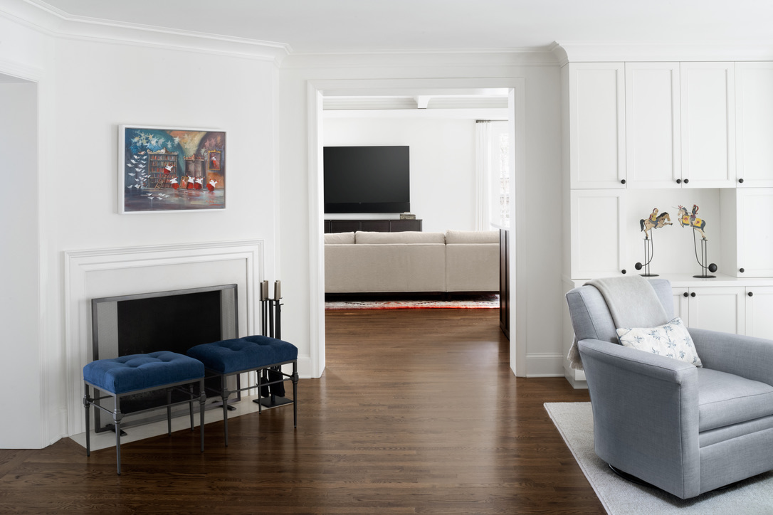
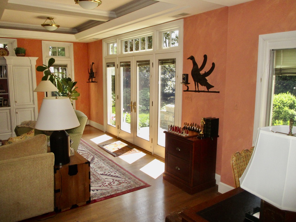
When their kids are home or the neighbors come over for movie night, this is where they go! This room was designed for entertaining – with lots of places to sit or perch. (Sometimes people don’t want to commit to parking themselves; they want to lean – we get it!) The ottoman can slide towards the couch as a footrest or the other direction, for extra seating.
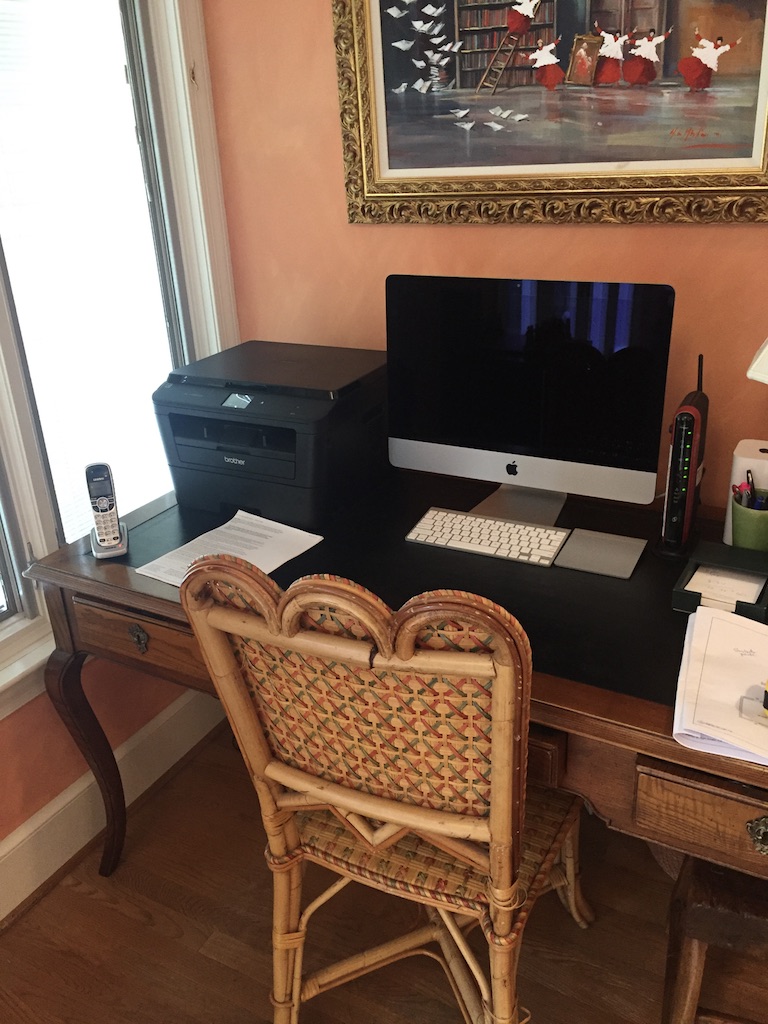
And then there is a second seating area that is still close enough to be a part of the action but allows those who don’t need to hear every play of every inning to hunker down together. Also, notice the double doors that we took out. More openings often constrict the functionality of the room. Enclosing both rooms allowed us to have the second seating area and the adjacent area became a private office (eliminating the need for that cramped workspace in the next set of photos). Otherwise, both areas would have just been wasted space.

What you can’t see clearly in the picture is the ceiling height change over the bar. The room felt like it had an extended entrance with the lower ceiling. Which made the bar feel just right here. Not only is the bar now an integrated part of this seated entertaining space but it serves as a subtle welcome mat to the room.
This room is interesting because it is in the middle of everything, meaning that you travel to different parts of the house through this room. Also, the husband is a talented piano player, and he enjoys playing for his family. Which made this centrally located room the perfect place for the music room. The piano is in the corner with the seating area nearby and adjacent to the fireplace. The piano can be heard throughout the house and it is a lovely room to walk through. And note that we replaced the rug with a smaller one that recognized the travelled areas – a slight but significant cue.
The previous and current powder rooms are just from different planets. I will give the interior designer complete credit for the wallpaper, which I doubted at first, but is absolutely spectacular. And the architect did a fabulous job of modifying the vanity so that it provided counter space but did not overwhelm the room. In fact, there are MANY parts to this project that were rescued from disaster by the talented team that worked on this house.
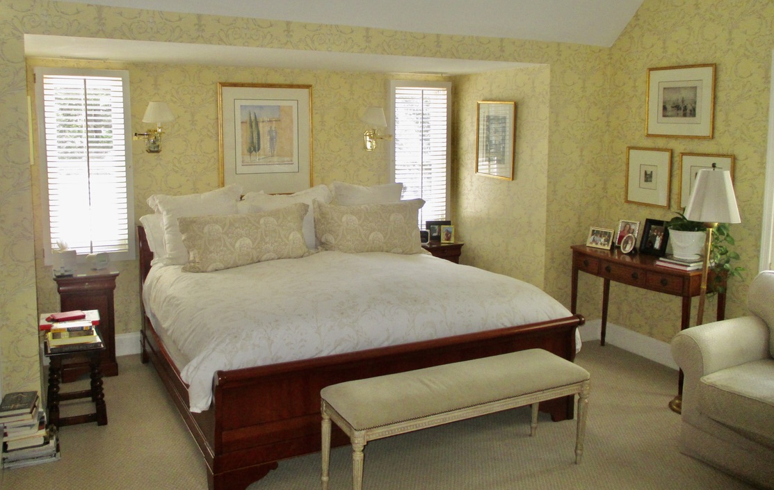
I fell in love with the cove for the bed the minute I saw this room – the nook makes the bed feel very cozy. But it was lost in all of that wallpaper! Instead, we highlighted the cove with another beautiful wall covering that the interior designer found – a Phillip Jeffries wallpaper that is even more stunning in person. And do you see those books on the floor in the before photo? That is a good clue that this house might need more bookshelves and so we obliged with matched custom bookcases that add interest to the room in addition to more room for books.

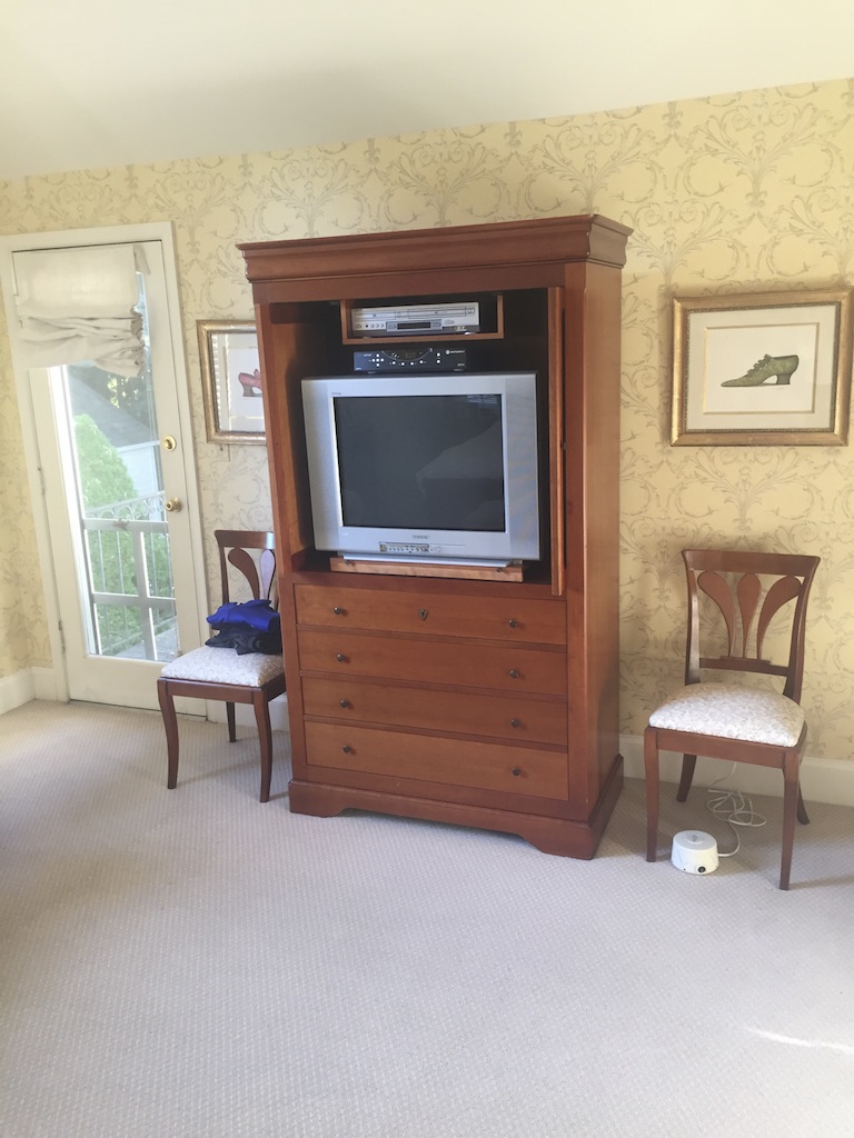
As you can probably guess from the size and model of TV in the armoire, this couple has not actually watched TV in their bedroom since 1998. And that door to the left went nowhere, but it did not previously occur to anyone to eliminate it. By removing what was unused, we were able to create a comfy seating area.
Believe it or not, the bathroom renovation was an afterthought. However, once the owner started envisioning the transformation of the rest of the house, the tiny warren of rooms that comprised the main bath had to go! The bathroom is light and bright, but you keep bathrooms looking pristine through storage, storage and more storage. (I am not sure why we always underestimate the number of towels, lotions and potions, just in case first aid stash and hair tools we actually own, but we do.) By moving things around, we created a large closet for all of those extras!
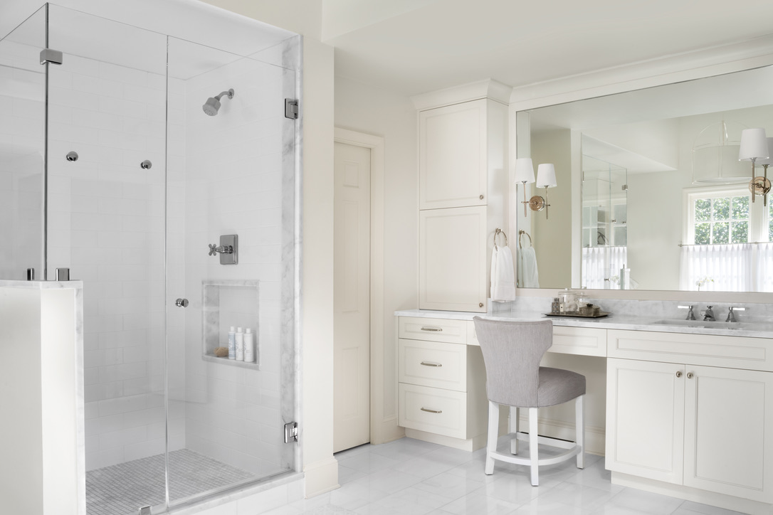
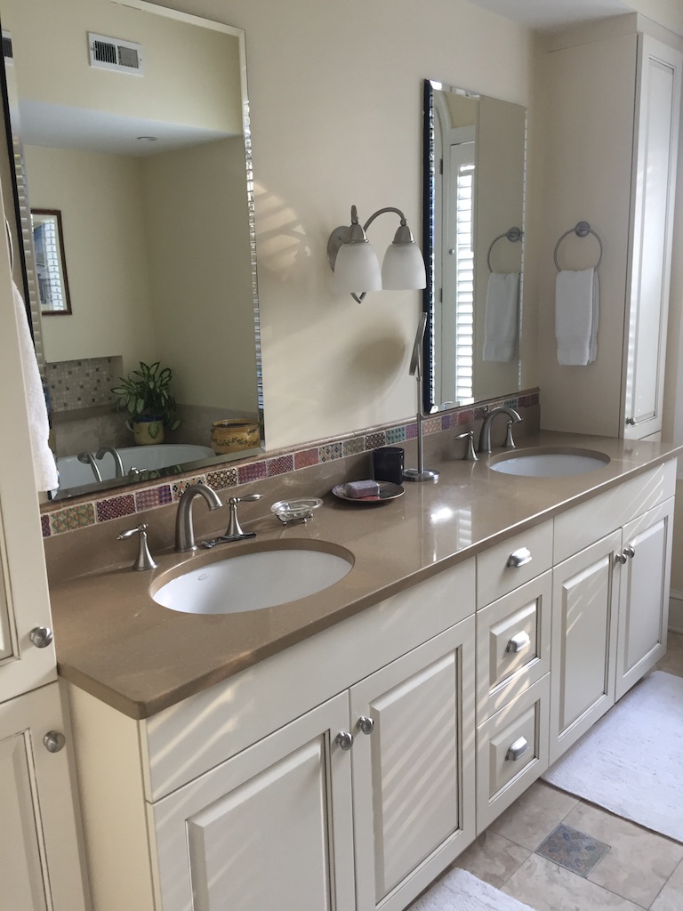

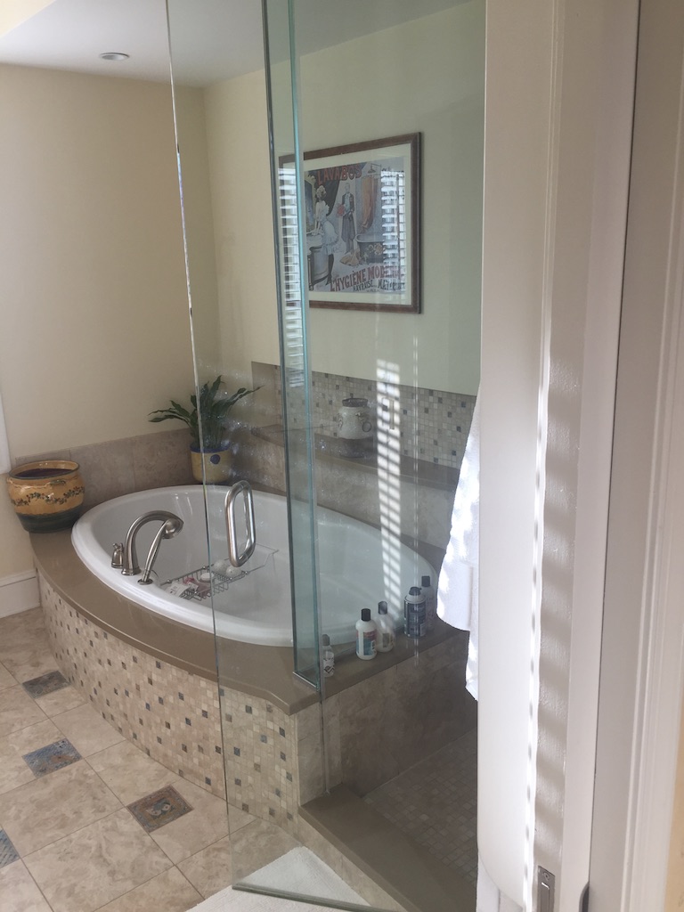
We did not want a rug in the open space between the vanities and closet. Instead, we opted for a tile inset “rug” made of the most beautiful Dolomite and Carrera marble mosaic. Why is this important? Because we were able to use more commonly available materials in the rest of the bath, saving the big show for this relatively smaller area. Also, the vaulted ceiling makes the space airy and graceful, but it is off center in the room. The room makes more sense by mirroring the tile inset to the vaulted ceiling. It just looks like a pretty bath, but we put a tremendous amount of thought into the layout, materials, storage and details of this space.
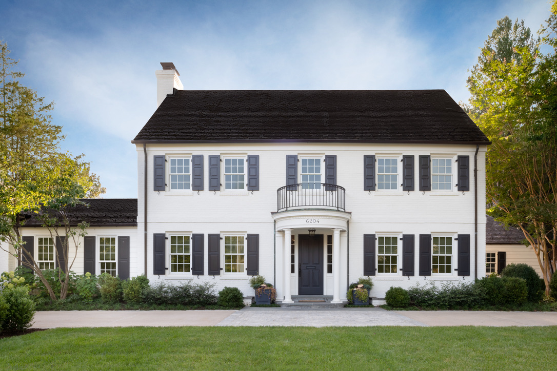
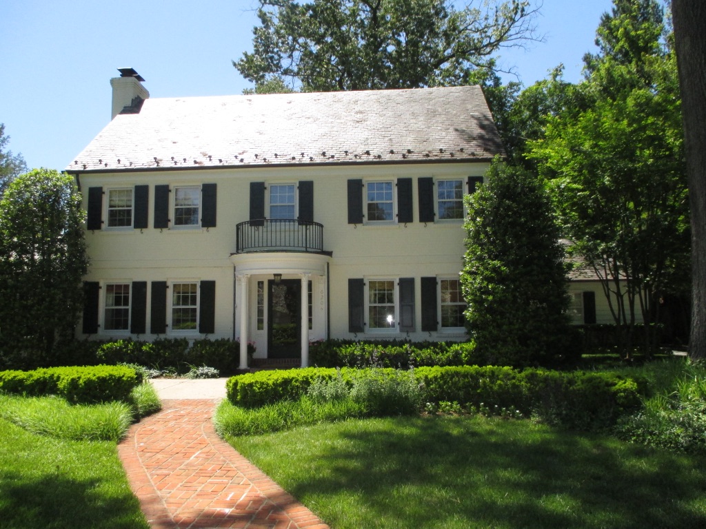
It is the same house! There are no structural differences, but it hardly looks like the same house. As the old saying goes – the devil is in the details. Most notably, we removed the two hollies on the sides which sandwiched and smushed the house. We also simplified the front, eliminating that red brick path, which related to nothing. There is a new border on the driveway giving the entrance a more expansive look. And the rest is just paint – a brighter white and a dark grey (not a green grey) on the shutters. You really can’t underestimate the power of paint and good landscaping!

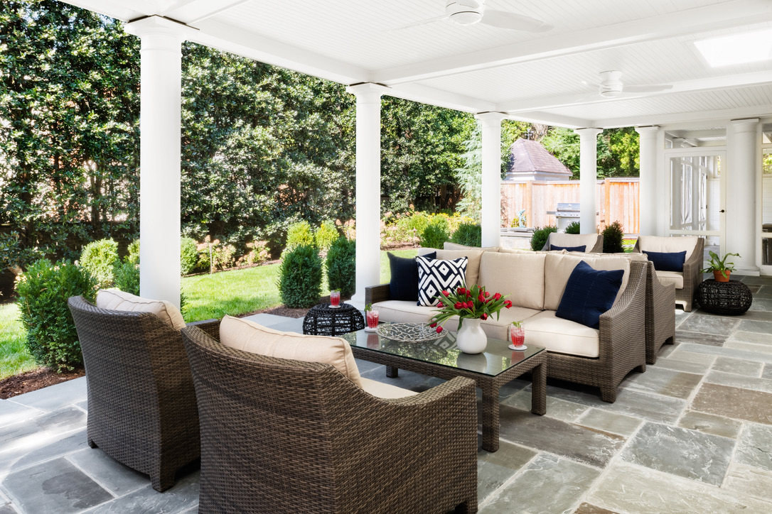
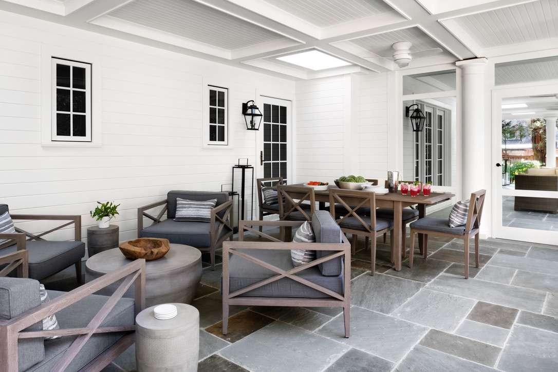
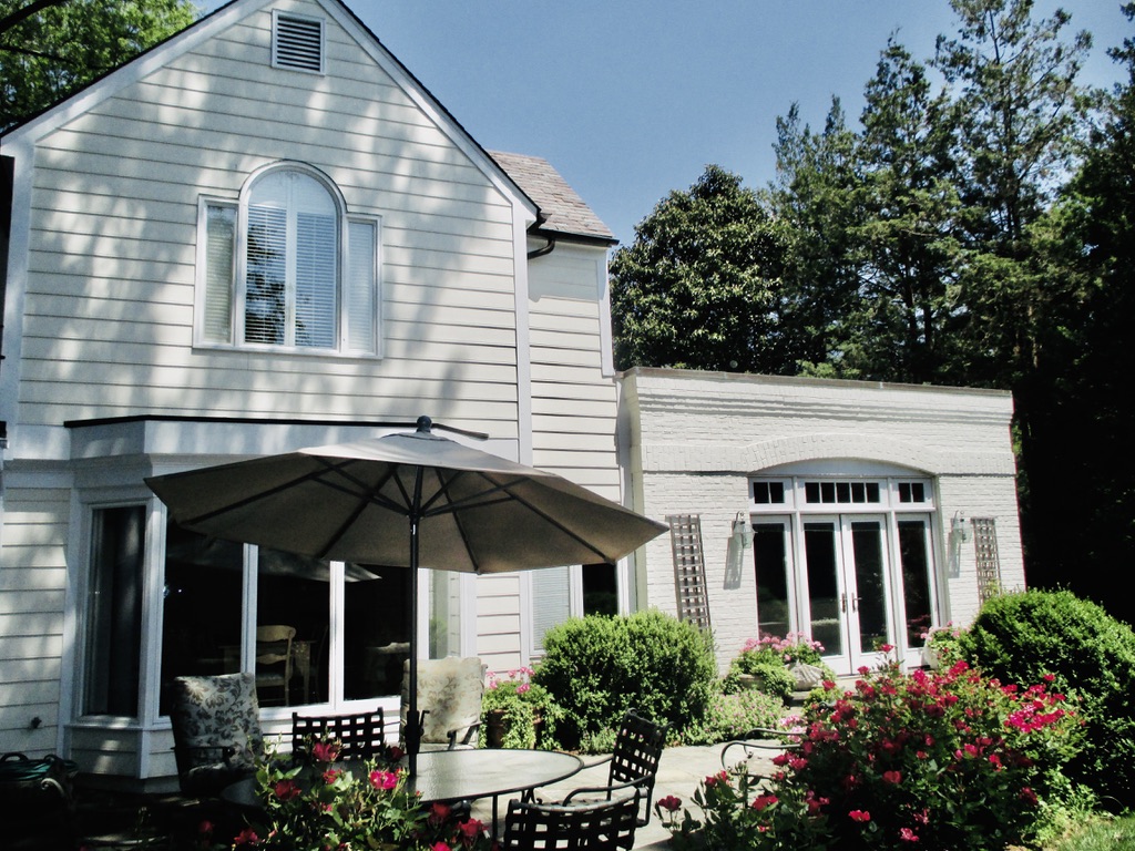
The only exterior addition to this house was this amazing porch! The old backyard was fine but generally unused and nothing special. Now, it is the owners’ favorite part of the house! Originally, we had anticipated a completely open porch, but the interior designer strongly advocated for a screened section and the areas work perfectly together. We put a dining area (no bugs!) and an intimate seating area in the screened porch and expansive seating in the open porch for entertaining. The owners also requested a fountain. We decided to position it by the grill, which creates a lovely ambiance when lounging in the screened porch and also makes a handy seating area by the grill.
In addition, we worked closely with the landscape architect to mimic the slight curve of the porch in the landscaping. In fact, there are a million details that we scrutinized and analyzed until we were blue in the face, but in the end, it is just a beautiful and functional space that owners adore.