
My guilty pleasure is a toss-up between Zillow and Realtor.com. I can’t resist the pull of a well done (or not so well done) house. It is astonishing to me that people spend their hard-earned money on bad renovations, i.e., contrasting tile in their shower niches or bathrooms with space but no storage. This house was transformed by paint, carpet, flooring, tile, adding a few walls, defining spaces and thoughtful storage. That’s it. Nothing fancy – elegant, functional and simple choices that make sense.
Inwood Abode
Photo Gallery


You can’t dismiss good bones. The symmetrical windows and modest gabled roof sealed the deal on this house. All it needed was new aluminum wood clad windows and a coat of paint. We went with double hung windows with actual grilles in a light grey color to match the traditional style of the house. And the house was transformed!
The leaded glass was outdated. We stained the front door a darker color and replaced the leaded glass with clear beveled glass. If you live on a busy street, clear glass might not be ideal but this is a quiet area and the new glass suits the new look of the house.


Even if you love fish, an oversized fish tank in the foyer is just a distraction. It was a 24” deep tank with barely 12” of wing wall. This is a good lesson in proportion and not crowding a space.
Your view when you walked in the front door was… a four inch wall, which drove me nuts. In order to define the foyer and create a more private family room, we added a 6’ foot front facing wall. The front door is clear glass but your view into the house does not extend beyond this art filled foyer.


A cardinal rule of my design is function first. A formal dining room was not important but an office was. We added another wall to enclose the dining room, added double glass doors to make the room feel more accessible and transformed the space into an area that gets used every day and not just 3 times a year.
What you can’t see in this photo is the huge closet that we added onto the back of the room which created an enormously practical storage area for the mess of a working office. This, in turn, gave us some flexibility to add built-ins to showcase books and art as well as a desk and a worktable.


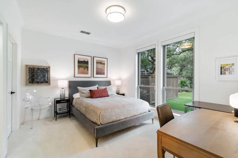
This room is long! About 21 feet. A bed sitting by itself is a little lost in all of this space. We added the small-ish settee and plexi coffee table at the end of the bed to ensure that the room was comfortably complete. Bonus is that there is a logical place to store bed pillows at night!
Cats and dogs are our loyal friends but their gear can be unsightly. We solved the problem of trying to make a bulky dog crate look appealing with a beautiful new bookcase that incorporates a ventilated space with a comfy bed.


Admittedly, I am a tad bit obsessed with bathroom storage. This room had a weird unavoidable angle because of an air return. If you can’t beat em’, join em’. I pushed the sinks closer together and added matching storage cabinets, connecting it all with a wood framed mirror and a polished Carrera countertop.
Carrera is a beautiful marble all by itself. You don’t need to dress it up or differentiate it with contrasting trim. Let it shine and it will stand the test of time. I also eliminated the bay window and added a high window, enabling us to forego blinds. Raising the pony wall allowed us to add a nice big niche in the shower for lotions and potions.


The original closet for the primary bath was WAY too small. The real selling point to the house was the old office that was on the other side of the closet. All we had to do was open a doorway and the old office became a fabulous closet.
I took advantage of the wonderful paneling in this room by highlighting them with inset mirrors, both functional and expansive. Also, this closet faces the front of the house, but you don’t want anybody walking their dog watch you choose an outfit. There are two blinds, one for light and one for privacy.


Renovations don’t mean throwing everything out. That vanity is the same! But with paint, new subtle calming wallpaper, a snazzy mirror, and an updated faucet, it looks like a different space. The hand towel was not helping either – I moved it to the other wall to give an unobstructed view of the scenic wallpaper.
There were so many great things about this kitchen – quality cabinets, plentiful storage, excellent appliances. It clearly needed paint, an updated backsplash and a new countertop – easy enough. We also lowered the countertop by the sink. Because this is a high traffic area, we rounded the corners – no accidentally bruised hips.


Those pendants looked like oversized upside-down ice cream cones. We solved that problem by replacing them with beautiful hand-blown glass globe pendants. And we added electrical outlets behind those big bulky cabinets to create appliance garages, thereby allowing the countertops stay clutter free.
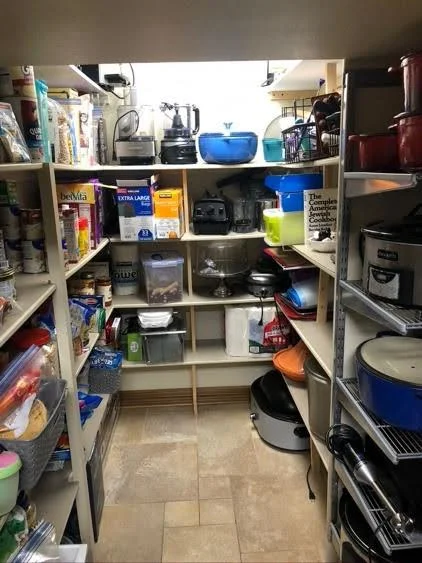
Pantries do not have to be dungeons. You also don’t need laboriously labeled coordinated containers for it to look good. Honestly, it is just some Container Store magic and throwing away the rice vinegar you bought in 2012. I am also a big fan of countertops in pantries, which keeps transient extras out of view, like homemade cookies and ingredients you are using for dinner that night.


Unifying the flooring in this house was a non-negotiable change and it made a huge difference. The table that was there previously was oversized as well. With a new smaller oval table and without the different flooring defining the walkways, this much travelled area is now wide and clear.
Let’s breakdown why this room looks different. First, we sheet rocked over those half round niches. Next, we married the bookcases on either side of the fireplace with floating shelves, added the same countertops as the kitchen and installed a Frame TV. And we did not change the fireplace – we just painted it.


Remember that we turned the dining room into an office. But this room was big enough to serve as a living room and dining room! It was also an awkward seating area with the furniture lining the perimeter of the room. The dining area balanced the room. With the breakfast area nearby, the entertaining possibilities expand.
The living room has a TV but was more of an entertaining space. This room is the cozy binge TV room – separate and private but close enough to the kitchen for easy access to popcorn!


The kitchen already had two huge Subzero refrigerators. The counter space and a hanging rod was much more functional than another fridge. These are the old cabinets – I just painted them and moved them up 5” on the wall to give the area more breathing room. And the “climbers” on the back wall, they are hooks!
You can have it all, you just can’t have it all at once. A chair in that corner was a great idea but you can’t fit a bed and a lounge chair on that wall – too much. We went with a ghost chair, which disappears but still provides a place to put on your shoes. We could have put a lounge chair in the opposing corner but went with a workspace instead. Just choices.


I rarely discourage storage but there are limitations; toilet toppers that hang in the middle of walls drive me bananas. We went with classic white subway tile, ½” hex on the floor, a quartz countertop and added a punch with the Slate Blue towels (from Restoration Hardware, a fan favorite).
Design is often a decision of priorities. A media room held little appeal but a dedicated place to exercise was a much more preferable choice. Note that this is the only room where we kept a ceiling fan, which makes sense that you might want some air when breaking a sweat.


The only bathroom that got new cabinets was the primary bath. To save some money and limit the number of cabinets we were throwing in a landfill, we kept the other cabinets and painted them. As they were all 30” tall, we added 6” mitered edge quartz countertops. Old cabinets; updated look.
Where do you put the furniture pieces that you are not ready to retire but they don’t deserve front and center attention? This second-floor landing area! The couch is from Wayfair and leftover from a long ago rental, but it is comfortable and in good shape. Those Pottery Barn chairs are actually 25 years old but still hold their own. Use what you have when you can.


Clearly, I am a big proponent of classic neutrals. But color has a place and is an important element of design. Thoughtfully placed, it highlights and complements everything around it. Notice how the orange moves your eye around the room.
It is a misconception that every bathroom needs to be a different design. This bath is similar to the guest room bath and it works in both areas. There is an argument to be made that the same materials unify the overall design; it is also a cost-efficient way to order tile without crazy overages.


You can’t paint plantation shutters. Even though they were in good shape, they had to go. You can’t save everything. We also painted all of the trim and doors in the house the same color as the walls, creating a much cleaner palette.
Those glued wall to wall mirrors scream outdated. As long as you are going to repair sheetrock, an electrician can wire two sconces, instead of the single overhead fixture. Together with the new framed mirror, the same space has a new look.


That is one long wall! In order to break it up, I gave the room zones. The bed is defined by the artwork and the lamps, there are floating shelves above the chair and the dresser bridges the two areas together.
Shower curtain vs. glass door? It depends. If you are bathing little kids, shower curtains win every time. If the bathtub is your token tub for the house but is mainly used for showers, the glass doors are so much more appealing than fighting the shower curtain as you get the soap out of your hair.


I am huge proponent of garages that actually house cars. Those barn doors hide the toolbox, ladder and weed killer, but keeping a garage free and clear entails a whole house plan and finding logical and suitable places for all of your stuff.
What outdoor furniture do you actually use? People assume they need lounge chairs or a sectional. Unless you live at the Four Seasons and the staff is cleaning the outdoor cushions every day, be thoughtful about the placement and type of outdoor seating.


Yes, the grass is not real. The previous owners installed artificial grass. Admittedly, I was skeptical at first but it is always green and it really is maintenance free! Also, we eliminated that fence because it completely interrupted the expansive view. Unless gardening is your passion, simple but hardy landscaping keeps your yard tailored and lovely.
