

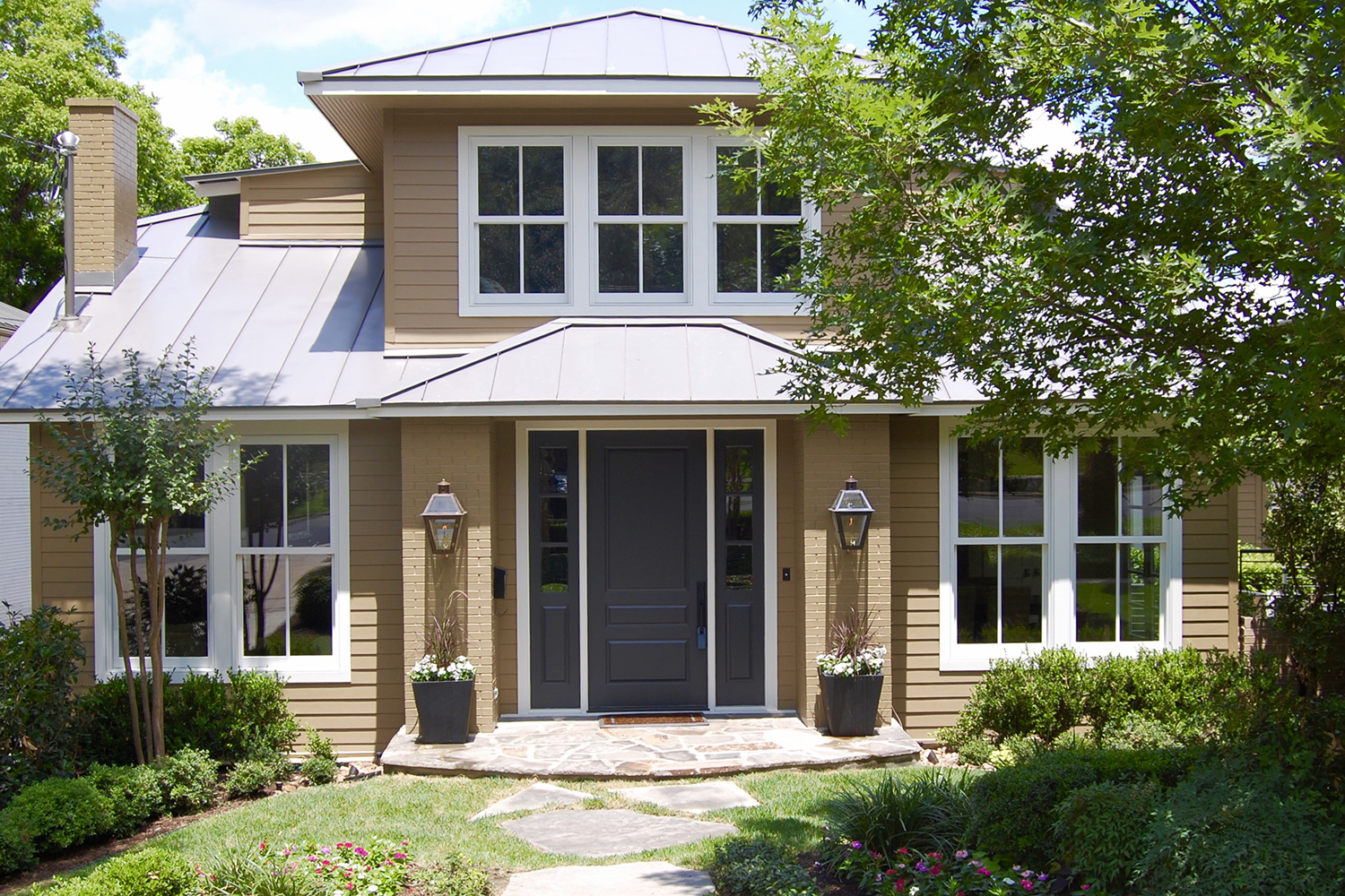
The front elevation of this house was one big SOS! The door is not centered. The roof of the front porch literally points your eye down. The proportion of the windows are all wrong. Honestly, the house looks depressed!
Modern Cottage
Photo Gallery
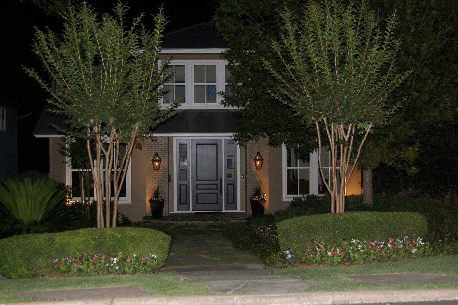
We joke around that we saved this house with “pitch and porch.” And it is kind of true. Just by changing the pitch of that upper roof and creating a symmetrical porch, we transformed it. We were fairly limited by the setback, but we were still able to give it dimension by adding brick columns on either side of the front door. Those gas lanterns definitely help. The new divided light windows added flair but were consistent with the style of the house. Interestingly, we did not actually have to raise the second floor roof; the space was there but those old windows did not do the house any favors. The richer paint color was the finishing touch. When you are looking at exterior elevations, well executed “pitch and porch” can save the day.
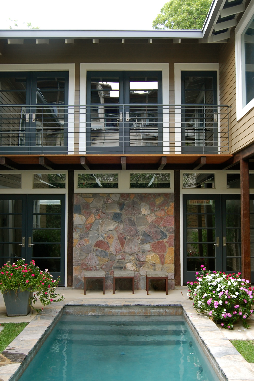
We carefully calculated all of the elements in the back of the house. That walkway is actually the way you enter the house from the garage. We had to give it space, which is not overwhelmingly obvious from this photo, but it is there, I promise. We used that flagstone around the pool, on the front walkway, in the pattern of the driveway and culminating as a focal point on that wall. Which, you might notice, lines of perfectly with the pool. Just in case you were wondering: yes, we planned that.
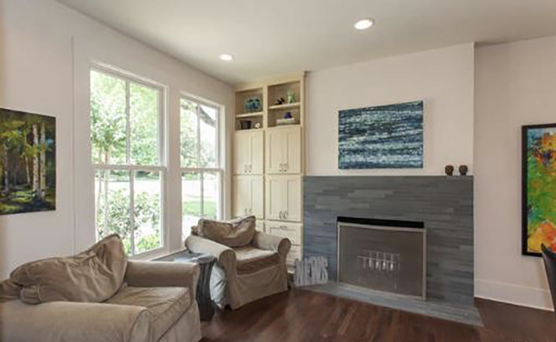
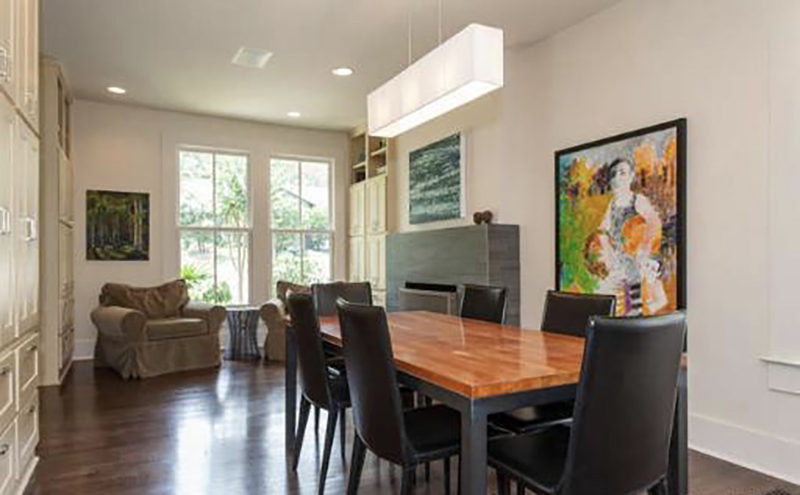
This house was actually a 1920’s house that was taken down to its studs and given a new lease on life. That fireplace was the old living room and that big ‘ole kitchen is new space. Renovated houses can be funky and you have to make them work for how we live now. First order of business: add storage. Notice all of those cabinets. They are lockers for the kids and repositories for seasonal dishes, formal china, vases and pitchers. Second: transform that awkward space on the other side of the kitchen table into a useful area. A small seating area worked perfectly and is close enough to the kitchen to chat with someone cooking. (P.S. I love those 1×9 grey tiles!)
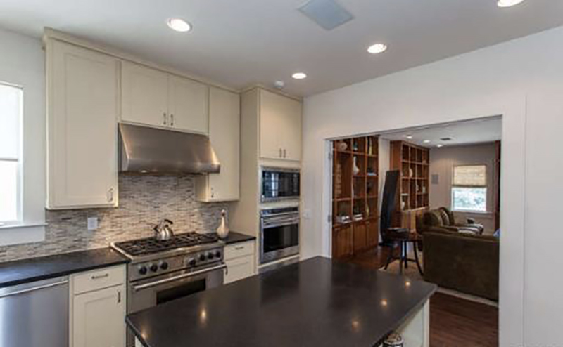
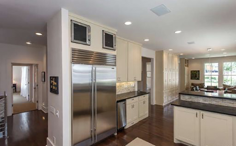
Floorplans get interesting in renovated houses. This kitchen is also a hallway and it needed to integrate into the house in terms of style and function. If you were wondering, those are wine fridges above the fridge! They were not used every day but we needed to put them somewhere?? Above the fridge worked! Renovating old houses can be challenging. None of the issues are insurmountable; they just take a little thought.
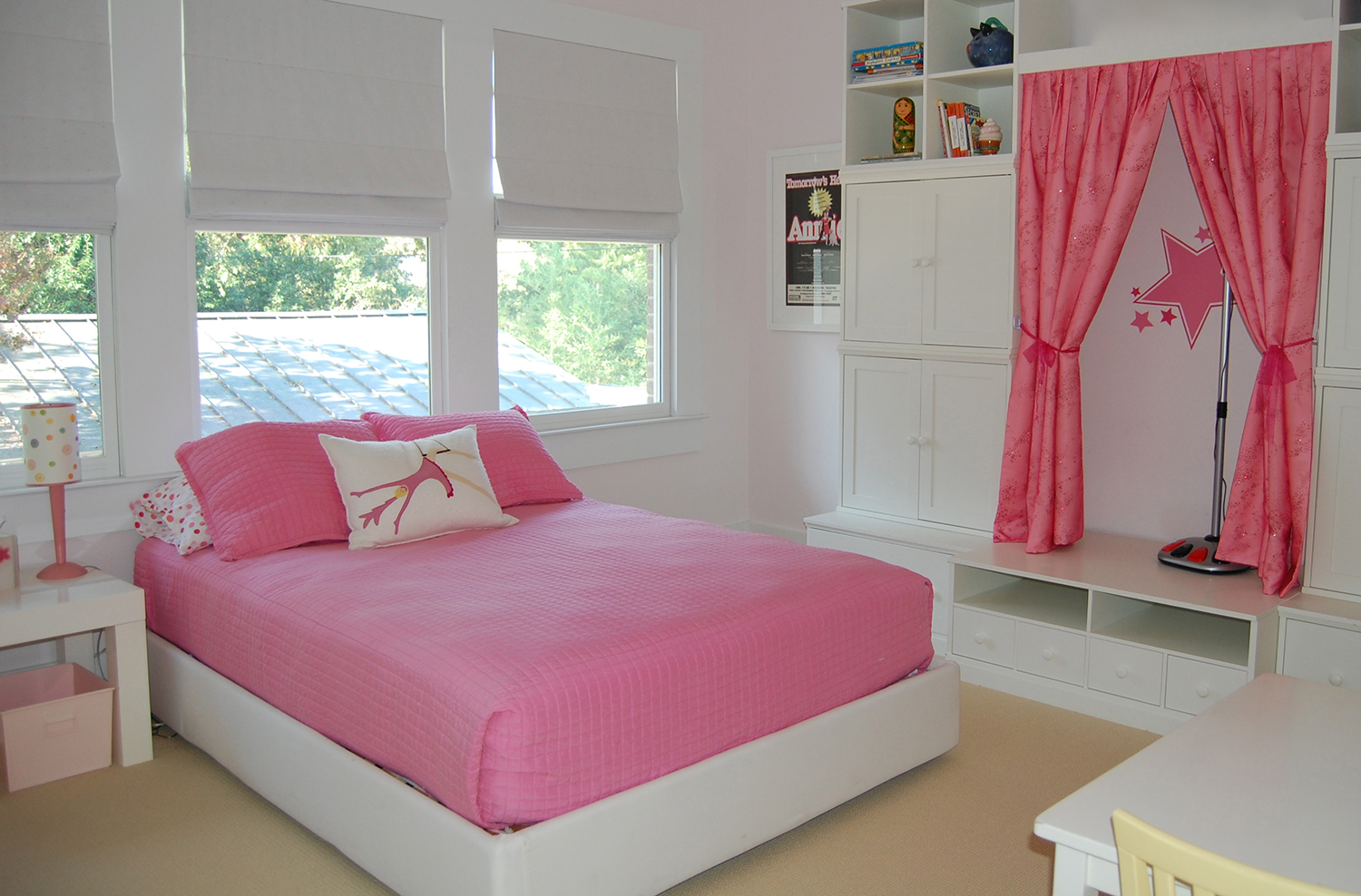
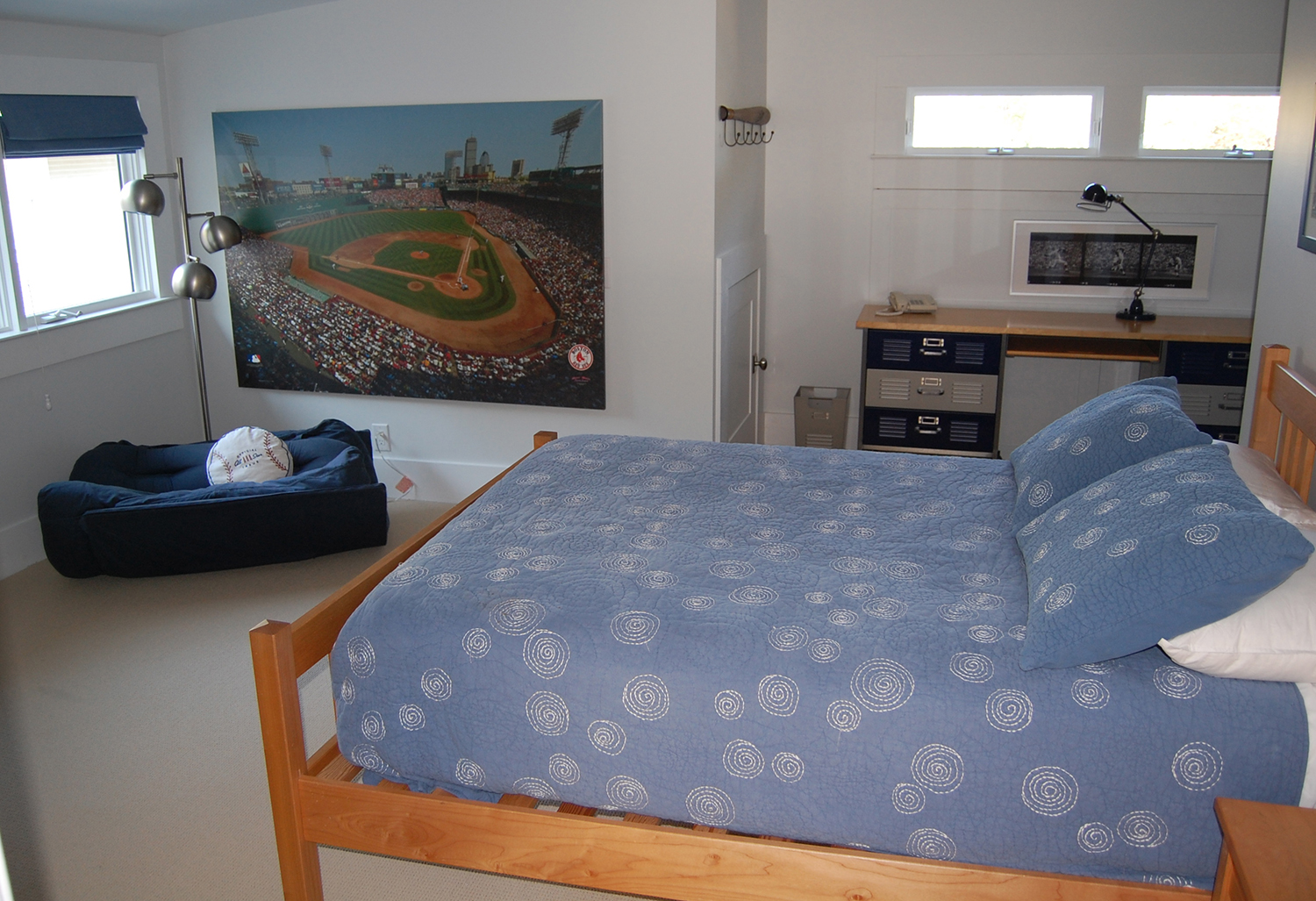
The kid’s rooms were small. We could not mess around with space planning. We squeezed in a fun stage in the girl’s room by modifying Pottery Barn cabinets and made the nook in the boy’s room a desk space. And we could not fit a full sized chair in the corner under the window but a bean bag chair did the trick and he probably liked it better anyway.
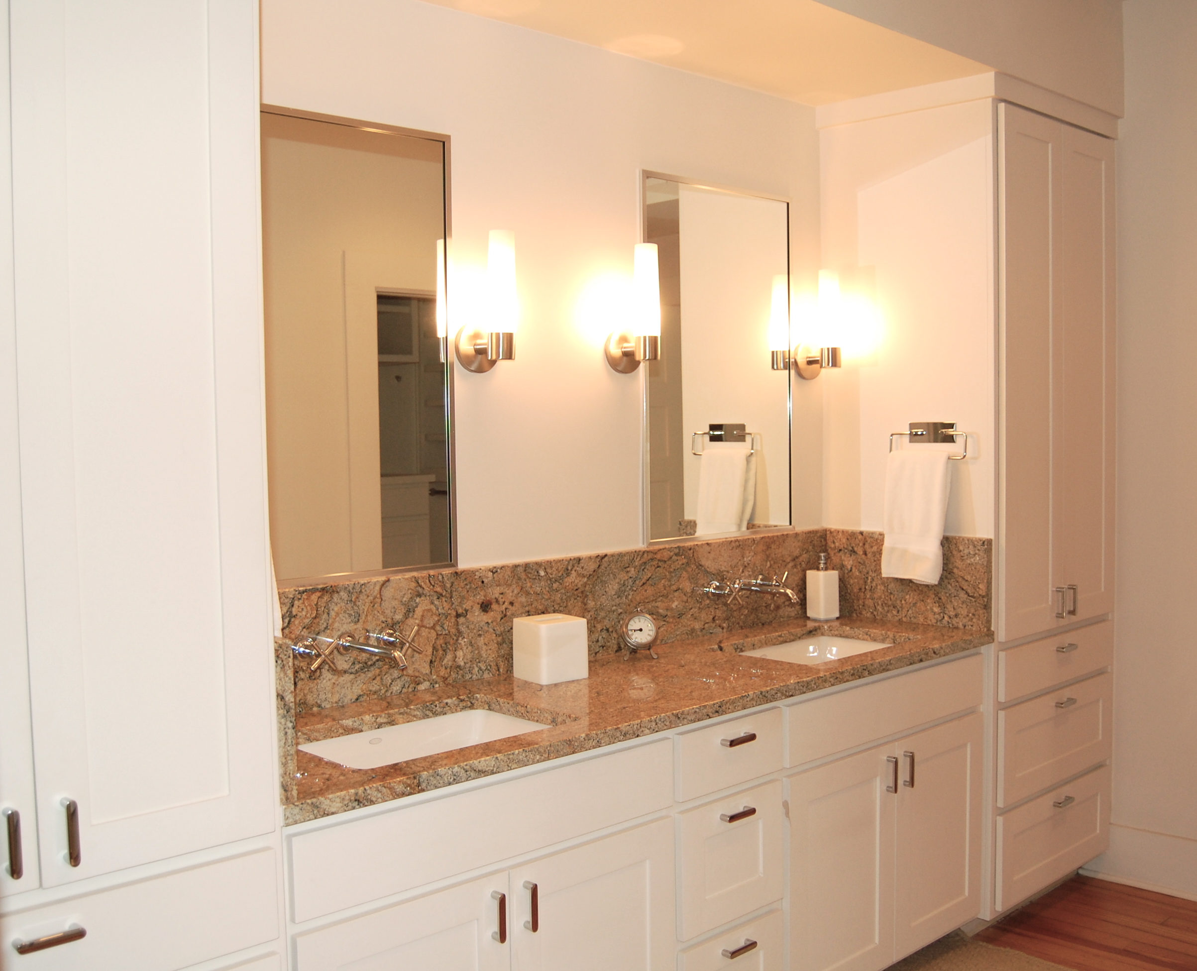
I have never understood pedestal sinks in a functional bathroom. Where do you plug in your electric toothbrush? What about floss, toothpaste, potions and lotions, make-up, hairdryers, curling irons, extra shampoo, Band-aids, vitamins? This list goes on and on and on! That means STORAGE. I am a big fan of wrapping plentiful cabinets around your main bathroom sink. Because if your stuff has a place to go, your countertop stays neat and tidy.
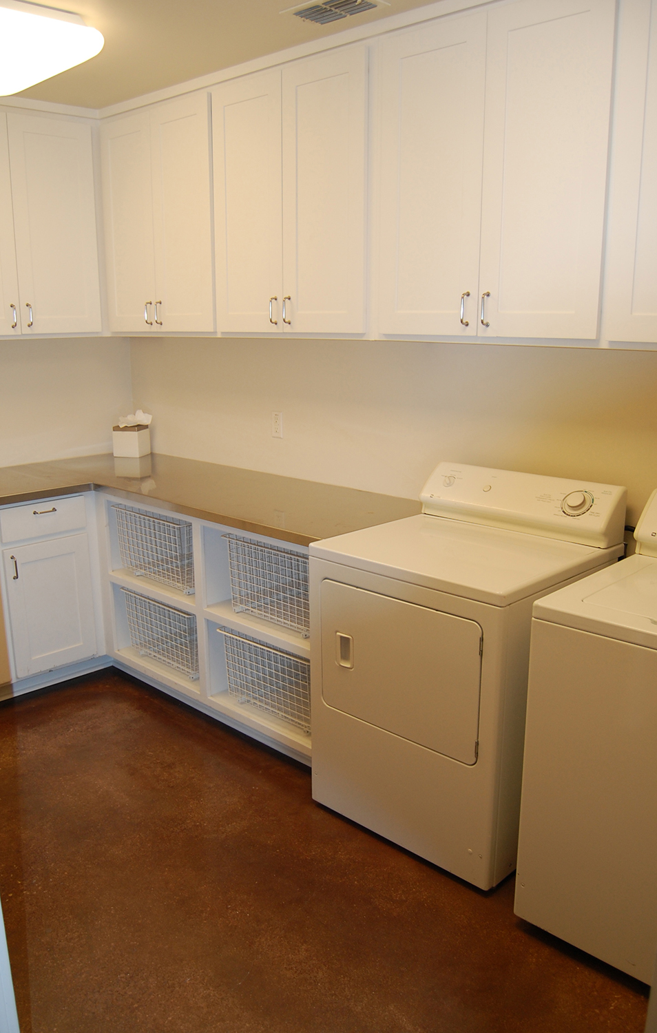
I know what you’re thinking: Huh, a laundry room. Correct! But did you notice the four laundry baskets in their own little cubbies? Clothes are constantly moving around in a laundry room – sorting dirty clothes, holding onto wet clothes before the dryer is ready for them, corralling dry clothes to be folded and lugging clothes back to their respective owners. Where do these piles normally go? Every flat surface available. But these baskets serve as the transition vehicle. You are not just standing there in the middle of the room holding your dry clean clothes wondering where you can stash them until you have time to fold. Those cubbies are the key!
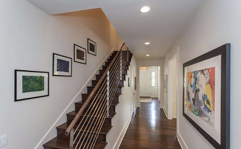
Art is a little magical. You can take a plain space, add art and wallah – instant personality! That being said, proportion is key. Which makes sense. A tiny little piece of art on a big wall looks silly. Thinking through the use of the space, the size of the wall, the views you have of that space and how much you genuinely like the art – all of those factors all matter. Don’t dismiss the magic of art.
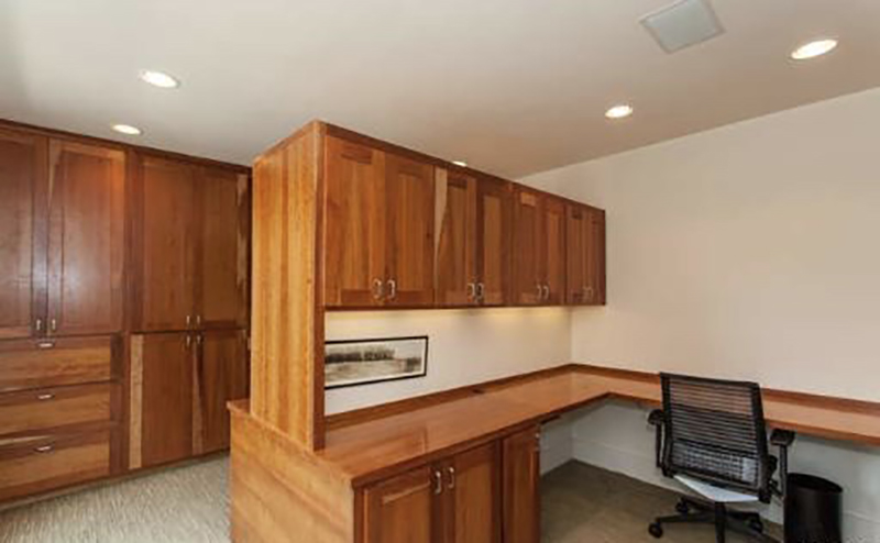
Do you know what you are looking at? It is an office with two desks. Why, you ask? Because our desk is where many of us get stuff done. With 24/7 everything, work is no longer allocated to 9-5. We need a command central at home too. In a household with more than one adult, you both need that space. You also need storage – think printer paper, pens and pencils, files, packing tape, stationary, bills, your old phone chargers?!? I don’t want to overstate it, but two desk offices can keep you both sane.
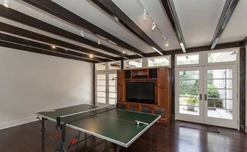
What kids do not like an open space to roam and play?? You can’t see them but there are loungy chairs on the opposite wall. Those doors open up to the pool. The ping pong table can be easily pushed aside to play computer games or for a bunch of blow up beds for sleepovers. This room is fun! (And I am glad we kept those steel beams in the ceiling visible; they give this big room added interest and they just look cool.)
