Small Town Digs
If you want to know what we were thinking about during this renovation read on.
This home was a hodge podge of castaways! It is probably similar to a lot of homes where random pieces are thrown together for the lack of a better option. Even that green paint (UGH!) was left over from the previous owner. But all of the new pieces are commercially available. Nothing here is hard to find! We thought through function, made a floorplan, spent a prodigious amount of time on the internet, added in a bit of elbow grease and help from some local professionals and wallah – a beautiful transformation!
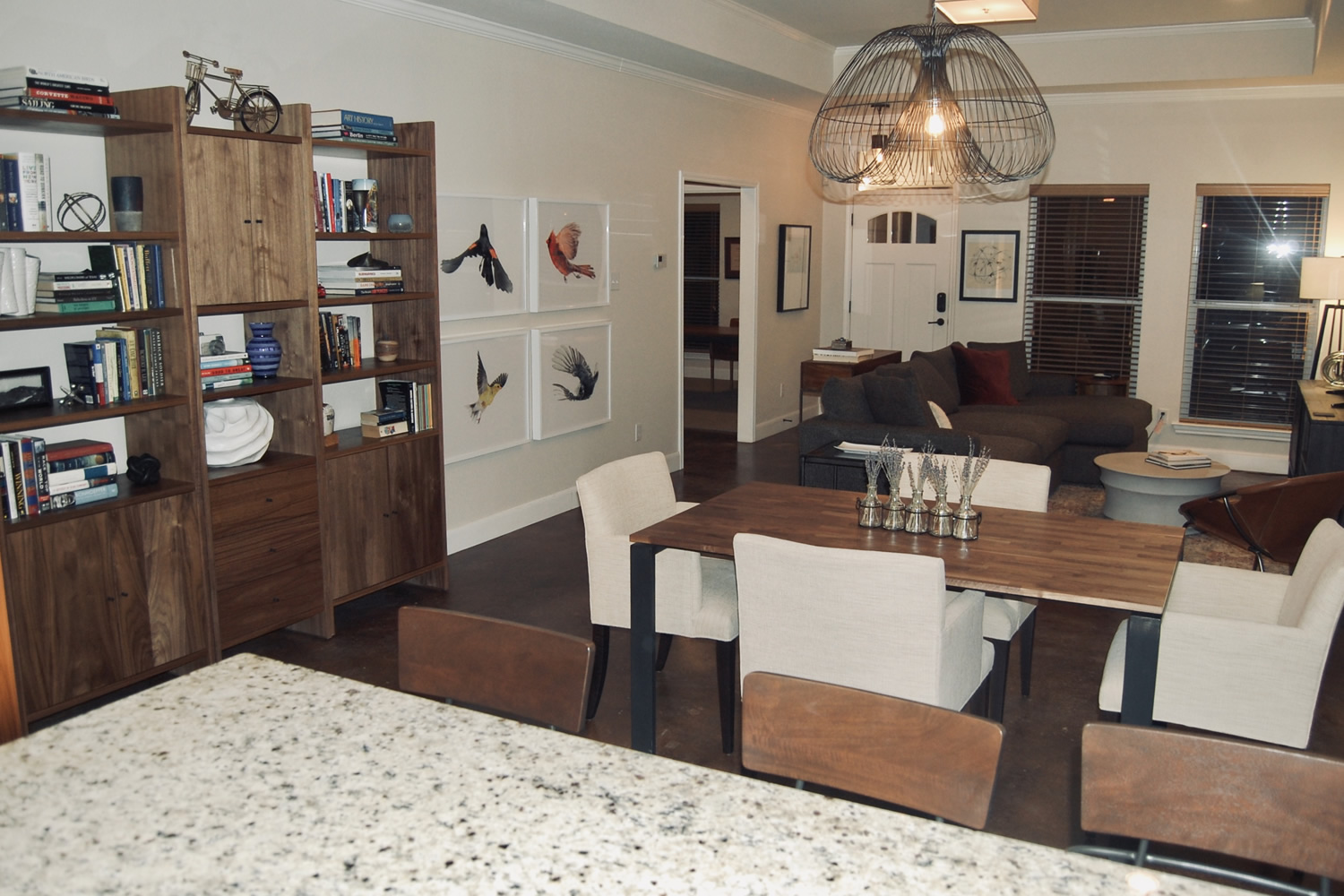
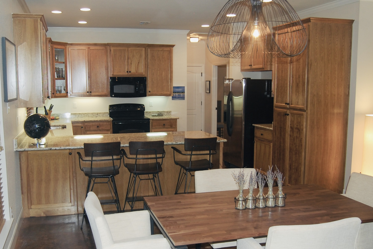
Can you tell that we moved the light fixture over the kitchen table? It was actually a clinch move. The builder centered the light on the windows; this was logical but not functional. We were then able to use counter barstools, which added an entire seating area and the space made a lot more sense. Also, I have to mention the little trinkets on top of the cabinets. Just resist. Little things on top of big kitchen cabinets don’t look right. If there is no soffit, let them be. Please.

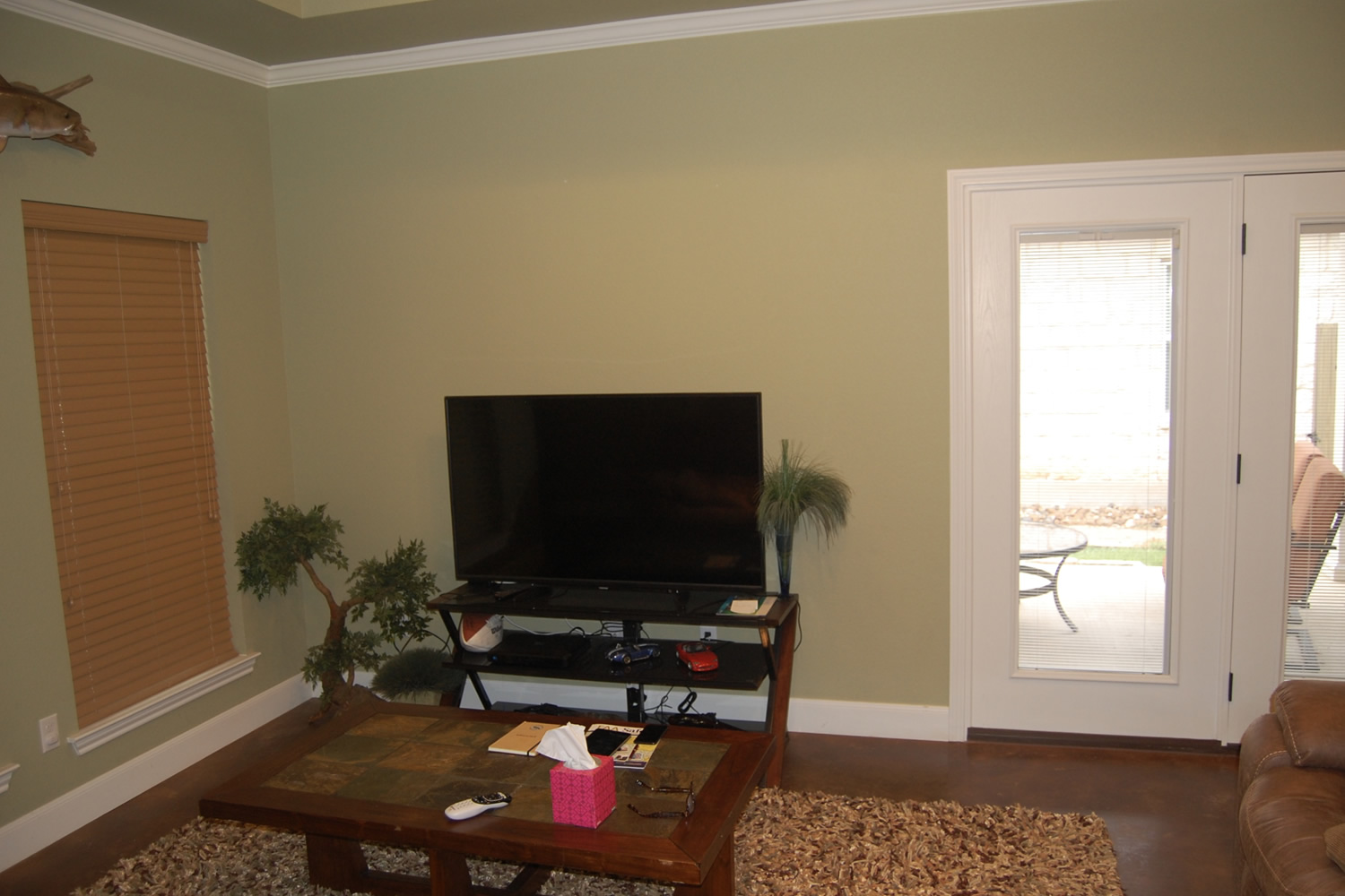
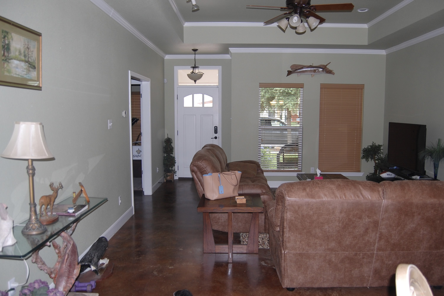
We added much needed lighting and kept the color palette simple, but function was the driving force here. The owner only wanted a place to watch TV and be comfy. With its deep seating and large chaise, the Lounge II from Crate & Barrel (a personal favorite!) fit the bill. The small side chair is perfect for the occasional guest. If the owner was constantly entertaining, the furniture plan would have been entirely different. As side note, nix the fake plants.
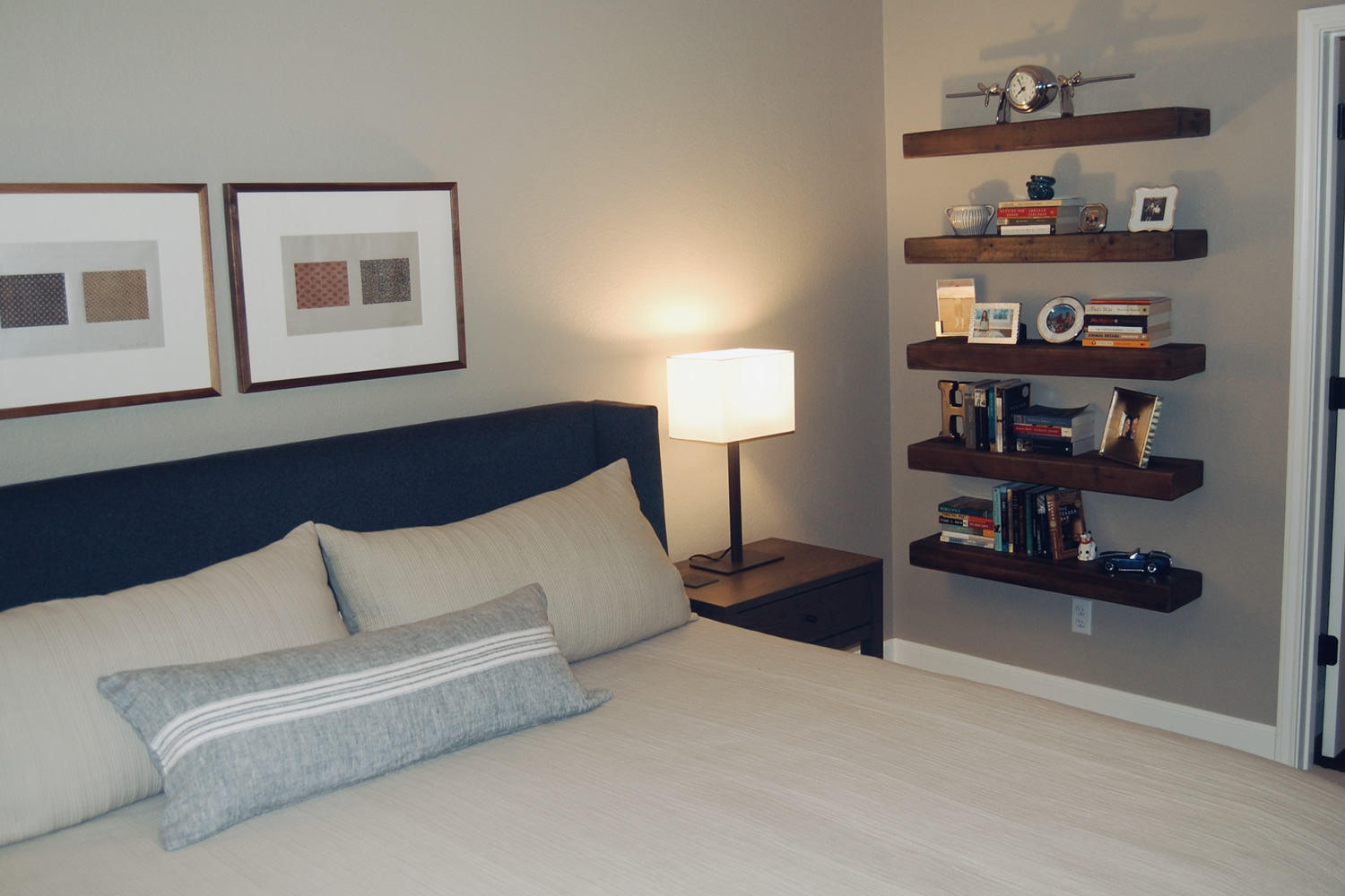
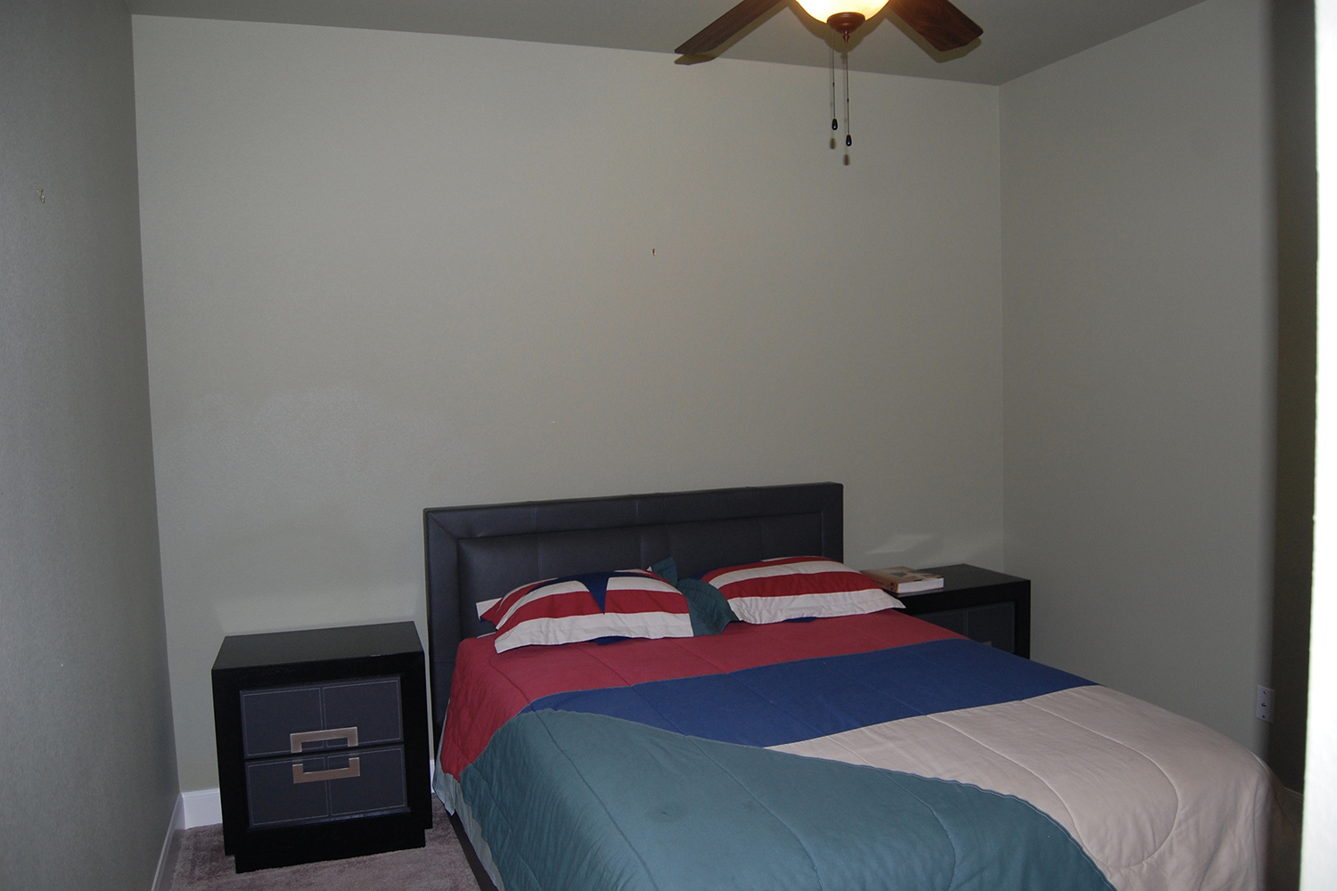
You should be saying to yourself right now: Why the heck is that bed in front of the windows? Admittedly, sometimes the layout of a room demands it and you can make it work. But it was not required in this space. And moving the bed actually allowed you to face the TV. Bonus.

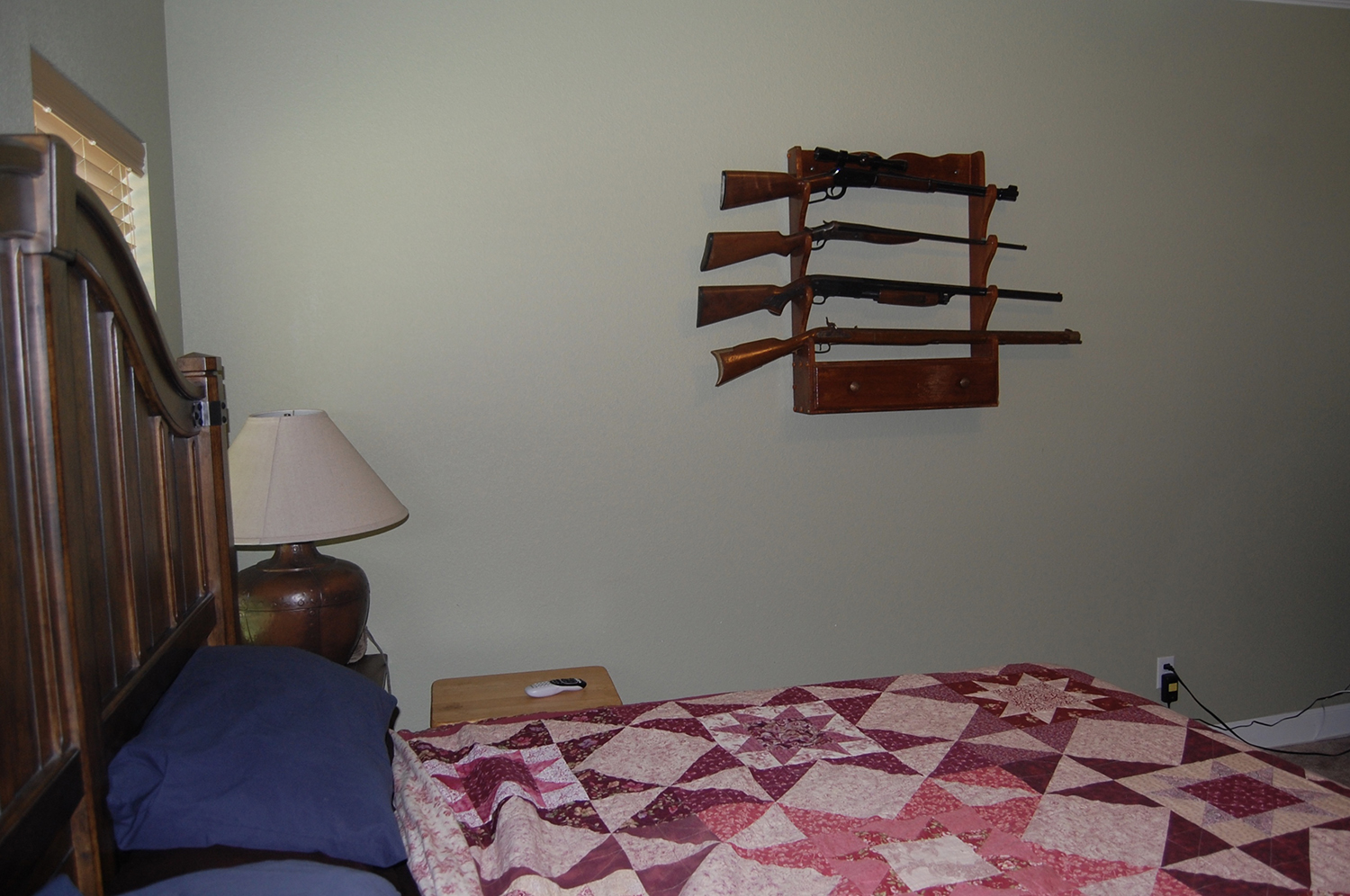
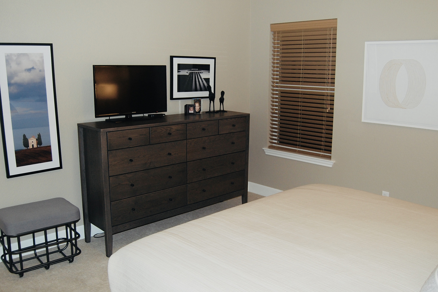
I know. The guns. Why? It is not that antique guns can’t be a part of attractive décor, but alone in the middle of that big wall??? The owner decided it was time to retire the guns after all, so we had a bit freedom with the décor. Look at how we balanced it: the tall solid dresser, the smaller open bench, the vertical and horizontal photos. And it fills the space. Make sense?
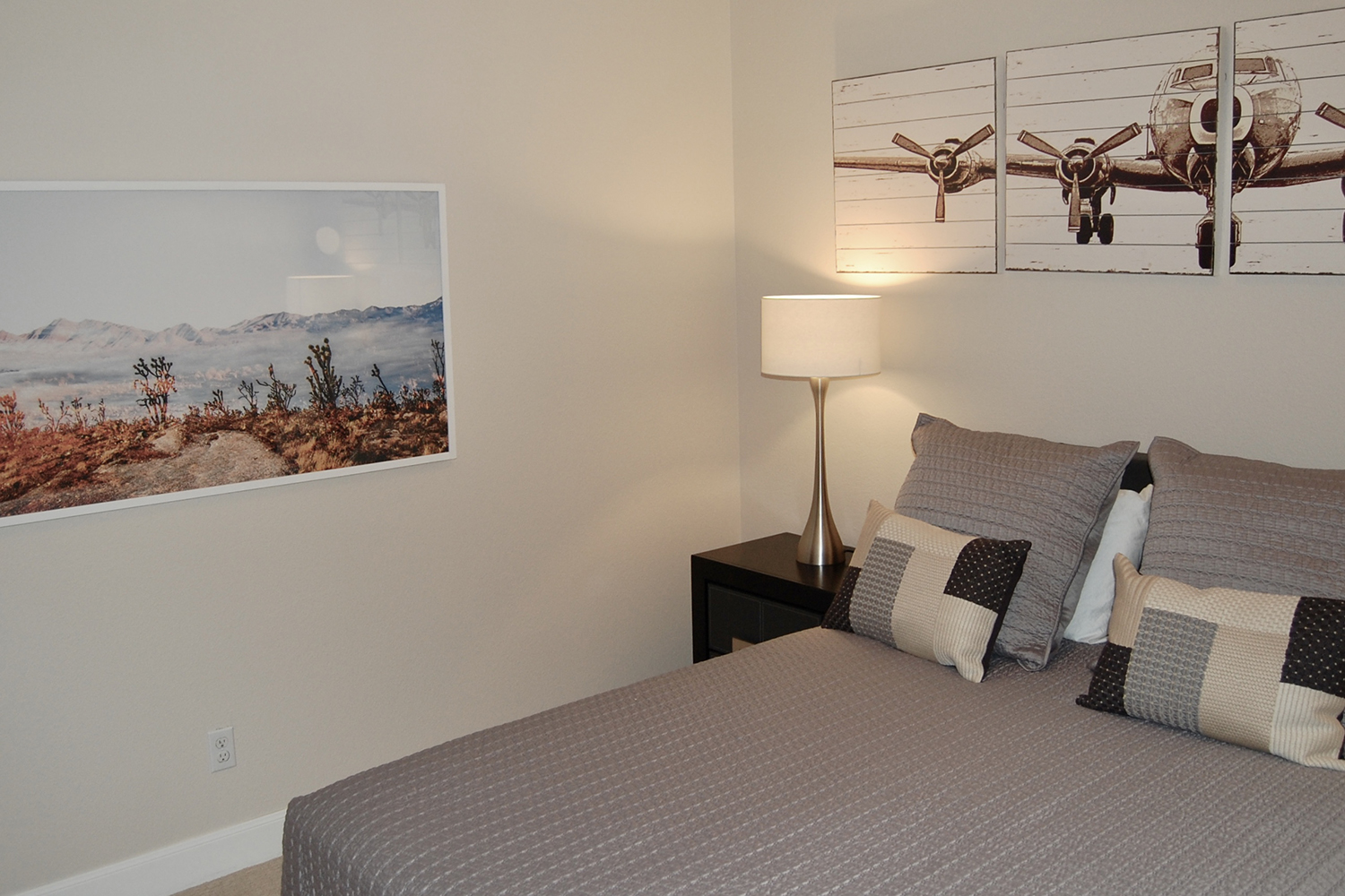
While guests should be gracious about their accommodations, there is no reason to subject them to empty walls and threadbare bedding! We left the headboard and nightstands and simply upgraded with a West Elm quilt, Crate & Barrel pillows and lamps and some fun prints. No fuss but inviting!
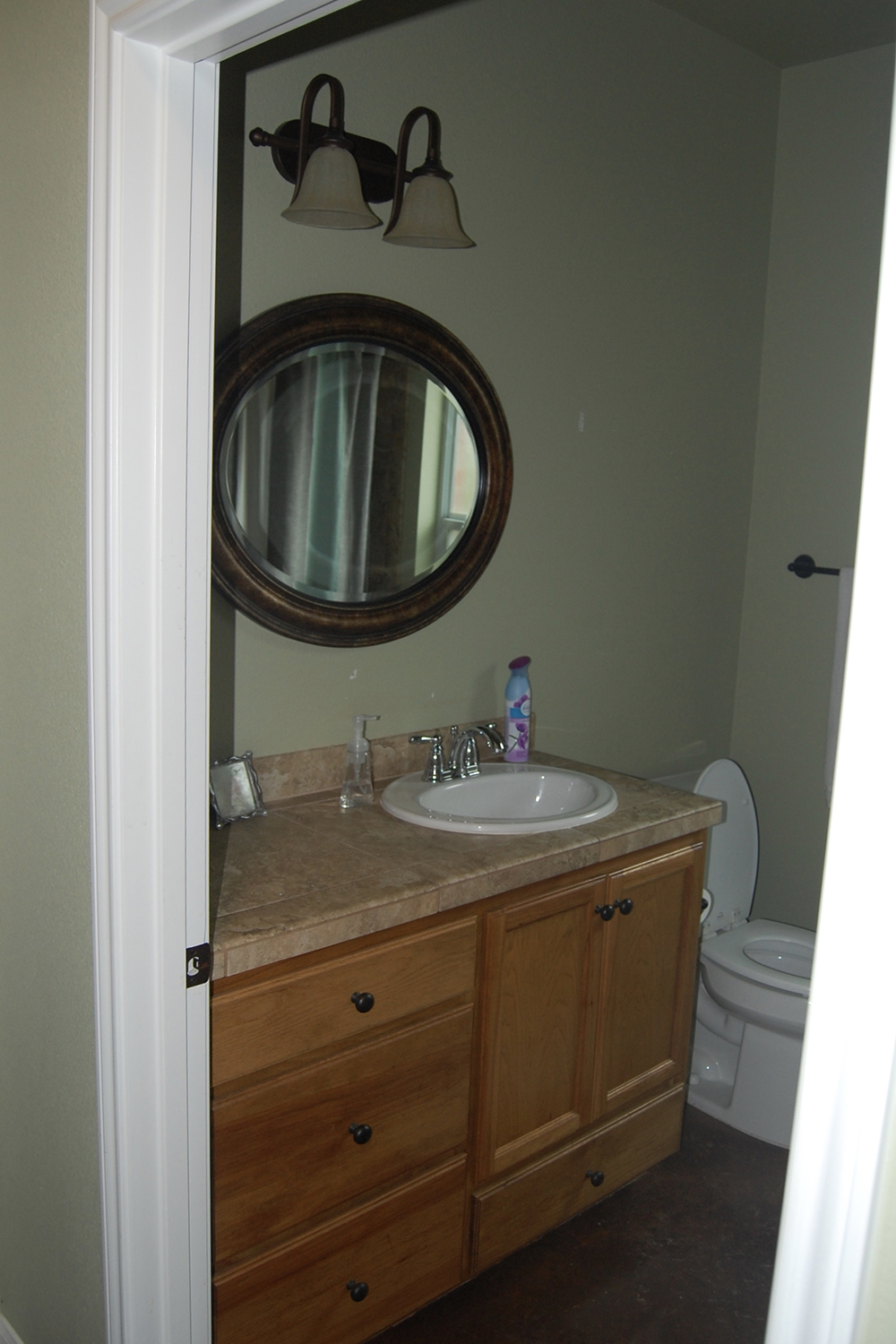
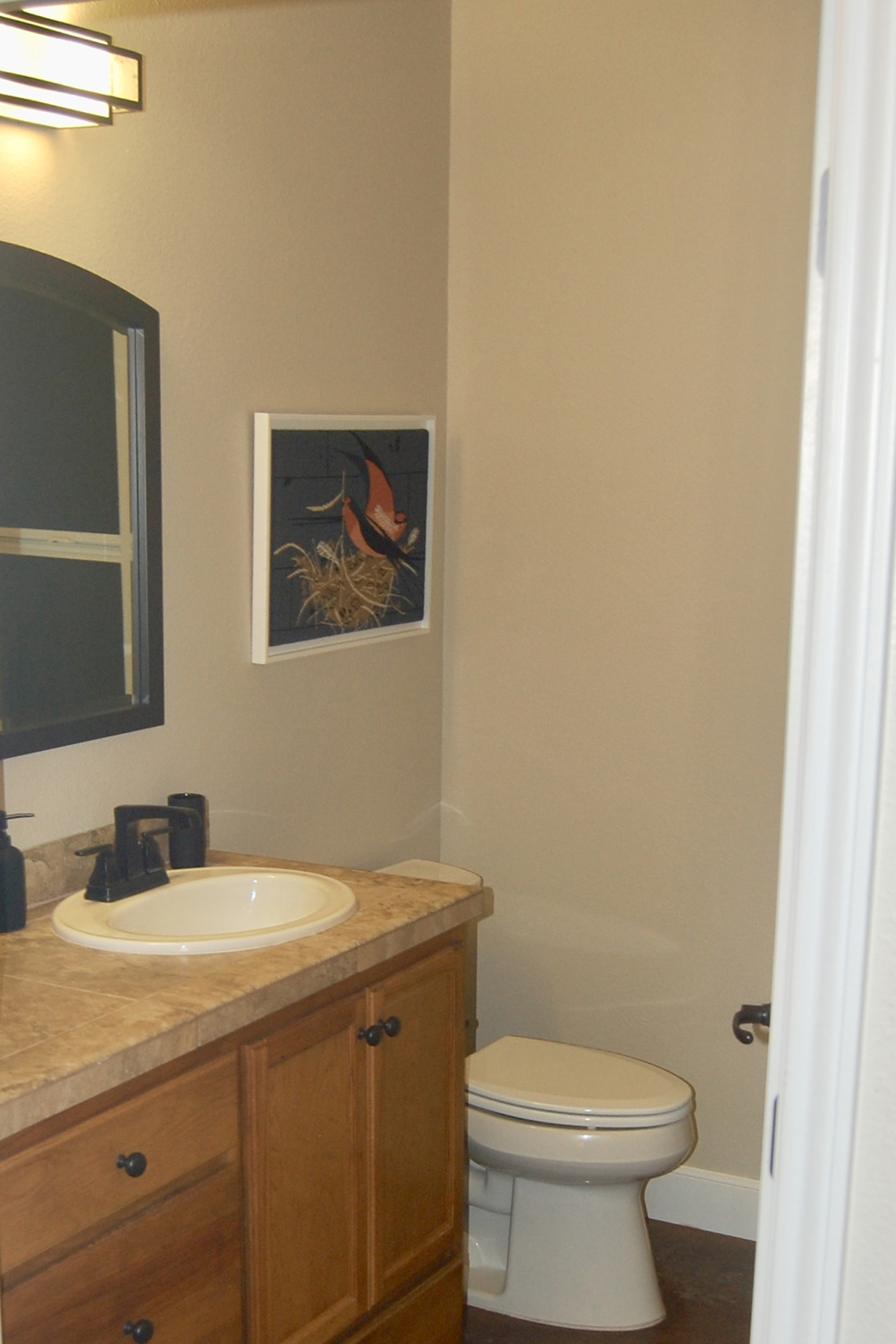
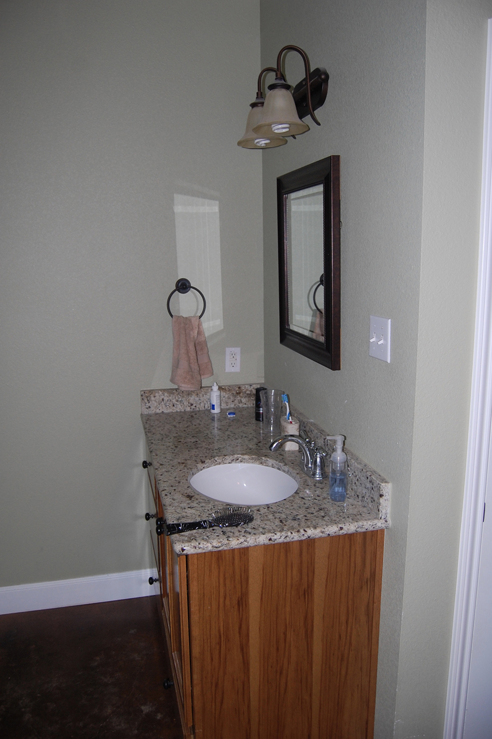
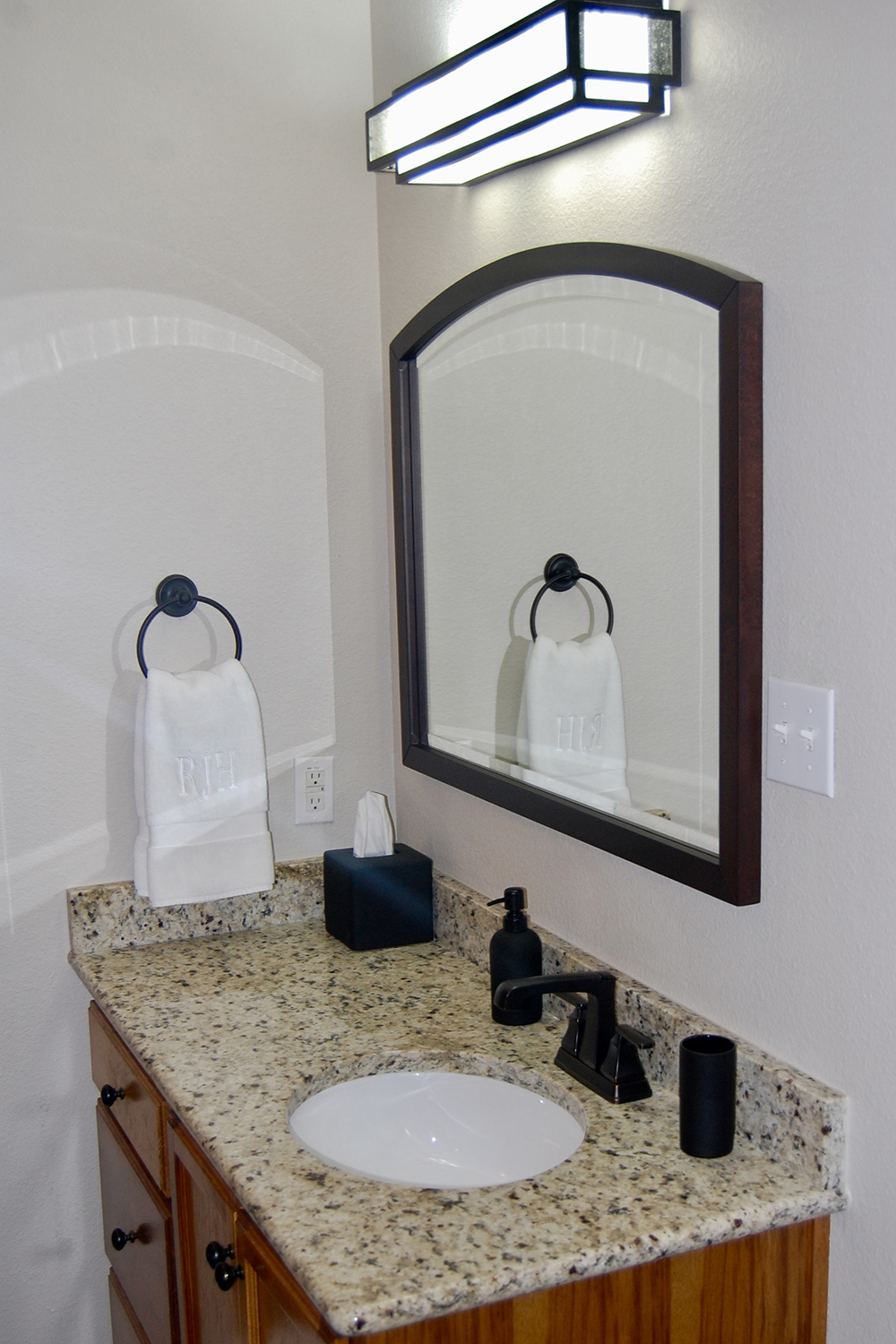
In both bathrooms, the basics were there. We only replaced the faucets, light fixtures and mirrors and we painted (that green!). And we used the same items in both baths. No need to get fancy with always trying to find unique items. It is a small house and the consistency works. There are times to get creative and times to let it be. Sometimes the trick is knowing the difference.
In my humble opinion, the after picture looks 100X better. But really look at the differences. We unified the bath accessories; it is the same function but now they are a consistent black. The wimpy beige towel was replaced with a plush one that was the right size. And notice the small mirror. You had to lean to the left if you were in front of the sink and the larger mirror fits the space better. It is a trite but true saying: the devil is in the details.